
Color Fields and Brushstrokes – The Painterly Expression in Abstract Art
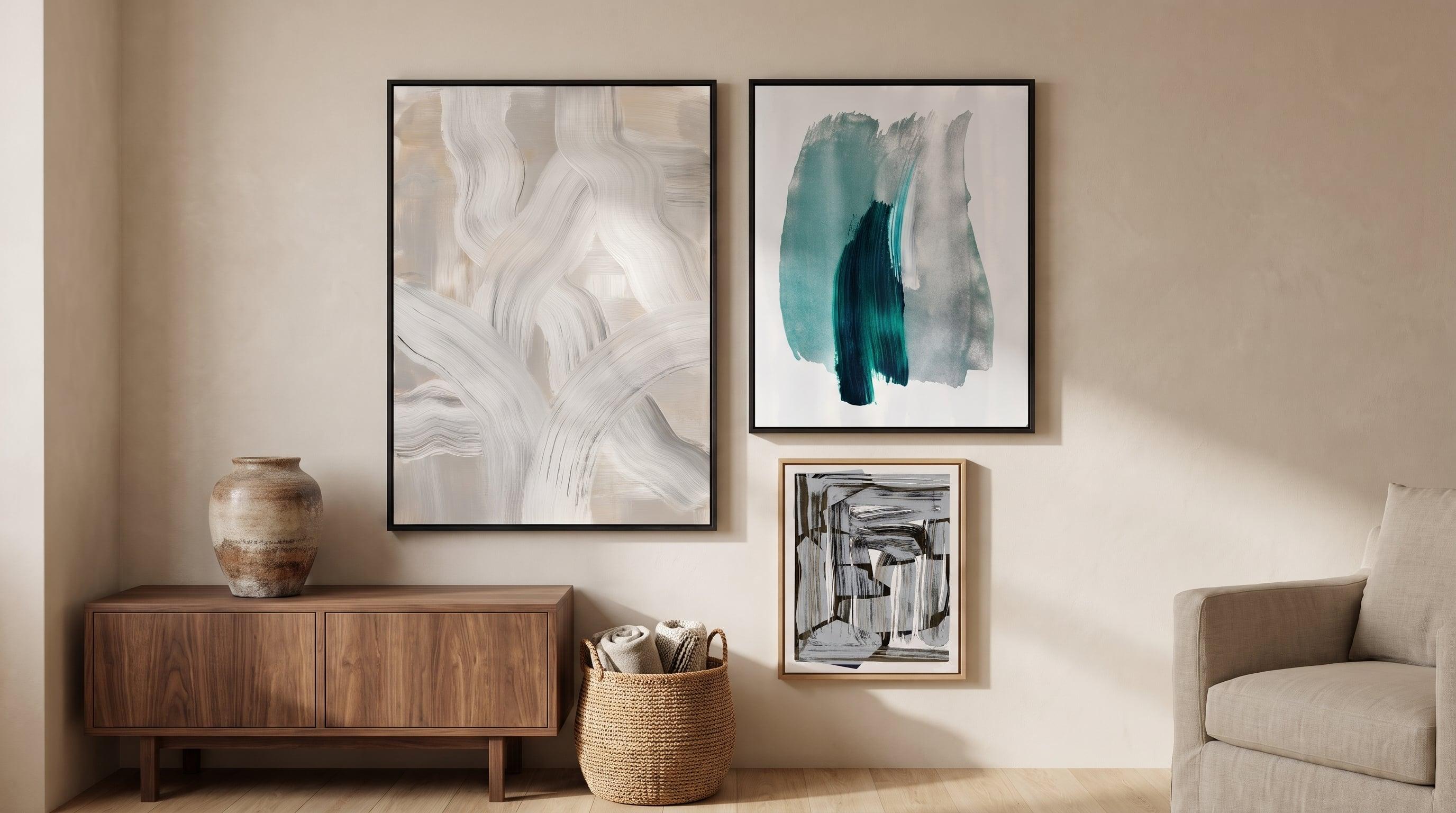
Painterly posters are the kind of poster you almost want to touch. Not literally – but the eye reads the surface as though fingers had already been there: a thickening in the paint, a fold where the brush turned, a stroke left to dry unevenly before it was frozen in place. The painterly expression in abstract art is precisely about this. The traces of a hand, a movement, a decision made in the moment that remains on the surface.
This differs from tight, graphic abstraction, where lines and color fields meet with mathematical precision and every edge is a choice rather than a chance occurrence. In painterly work, there's no such clear boundary between form and background. Instead, there's a surface in constant motion, where every brushstroke carries something of the process behind the image – the tempo, the pressure, the will to leave traces rather than hide them.
The Brushstroke's Physical Presence in Giclée Prints
Reproducing texture in print is harder than it sounds. A screen can display color, but it struggles to show body – that sense that the paint was once liquid and then hardened in varying thicknesses. Giclée printing, which builds up the image using twelve colors rather than the four standard in ordinary printing, captures far more nuance in the transitions between light and shadow on a painted surface. That's where much of the painterly expression actually resides: not in the subject matter, but in how light breaks across an uneven edge.
The paper matters too. A glossy surface would reflect light back and flatten the impression of depth. The matte, uncoated Fine Art paper instead – 200 gsm, FSC-certified – absorbs light in a way that lets the eye perceive the nuances of a brushstroke as actual relief, even though the paper is of course completely flat. In large formats, where the surface takes up more space on the wall, this tactile quality becomes even more apparent. The result is posters where you can sense the materiality of the original, without it ever becoming a copy pretending to be something it's not.


The Classical Roots of Painterly Abstraction
The painterly visual language has a long history before it became abstract. The Impressionists were among the first to let the brushstroke appear as a brushstroke – not as a necessary evil on the way to a smooth, illusionistic surface, but as the actual content of the image. Claude Monet's depictions of the Thames and the Houses of Parliament in fog build their expression almost entirely on the rhythm of the brushstroke; form dissolves into light rather than being defined by contours. The same applies to his Japanese bridge, where water and vegetation merge through short, repeated strokes.
Vincent van Gogh took it a step further. In works like the olive trees from the late 1880s and in his self-portraits, the brushstroke isn't just visible but directly load-bearing – a thick, directional structure that almost functions as its own visual language alongside the subject matter. It's no coincidence that these paintings are so often cited as precursors to what would later become pure abstraction: once the brushstroke had been given permission to be seen, the step to letting it stand entirely on its own wasn't far at all.


The Inner Life of the Color Field in Abstract Painting
In purely painterly abstraction, there's rarely a clear central subject to lean on. Instead, it's the color field itself that carries the image – and this is where texture makes the biggest difference. An even color field in graphic design can feel cold, almost digital. A painterly color field, built up from layer upon layer of varying transparency and direction, has an inner movement that keeps the eye from ever quite resting on the same point.
It's about a glow that seems to come from within the surface rather than sit on top of it, about boundaries between shades that flow rather than cut. This type of work often works best in pairs or groups, where variations in intensity and temperature are allowed to converse with each other rather than stand as isolated statements – a line of reasoning that echoes how you choose abstract art to match the mood of a room.


Between Figuration and Dissolution
Some of the most interesting painterly visual language lives in the borderland – where you sense a face, a body, or a mountainside, but the form never quite lets itself be pinned down. This is a deliberate choice rather than a lack of precision. By letting the figure dissolve into brushstrokes and fissures, the viewer is forced to linger longer, to fill in for themselves what the image only hints at.
This type of work acts as a bridge between the figurative and the purely abstract, and often has a physical, almost geological quality – as if the paint wasn't just applied but broken forth.


What the Painterly Adds Beyond the Graphic
It's easy to think of graphic abstraction and painterly expression as opposites, but they complement rather than compete with each other. Where geometric abstract art contributes order, direction, and rest for the eye, the painterly contributes warmth and history – a sense that the image came into being through a process, not just composed on a screen. On a wall with several pieces, it's often the contrast between these two registers, the tight and the uneven, that makes the whole worth looking at more than once.
Painterly work also requires no explanation to function. You don't need to know about Monet's late career or van Gogh's technical approach to respond to the surface – the body recognizes the trace of a movement before the brain has had time to analyze why. Those who want to dive deeper into how this kind of visual language works beyond the subject matter can read more about reading abstract art beyond the subject.
Frequently asked questions
- What is meant by painterly posters?
- These are motifs where the brushstroke, the texture of the paint, and the uneven surface are a visible part of the expression – rather than pure, graphic shapes with sharp contours.
- Does the texture show in a print the same way as in an original?
- The giclée technique with twelve colors, combined with matte Fine Art paper, reproduces the nuances of light and shadow in great detail, which makes the structure of the brushstrokes stand out clearly even in print.
- Do painterly posters go well with more graphic, geometric art?
- Yes, the contrast between the tight and the uneven tends to make a collection of works feel more alive – the two expressions balance each other rather than compete.