
How to Choose Abstract Art Based on Your Room's Mood
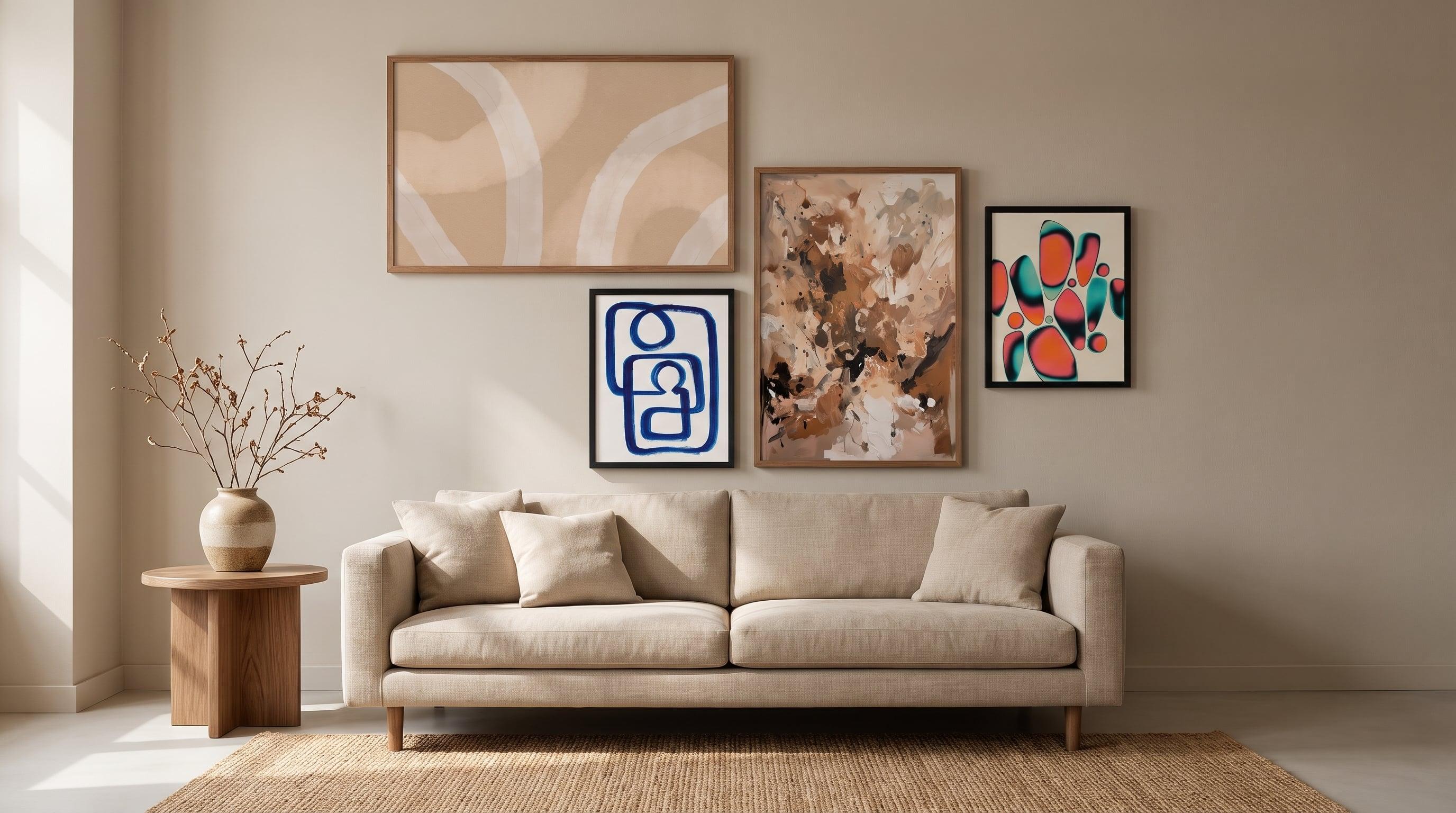
A living room wall carries more responsibility than it's usually given credit for. It's the backdrop to dinner conversations, to afternoons with a book, to those quiet moments when no one's talking but everyone's still present. Choosing abstract art for the living room is about more than colour – abstraction has a particular ability to heighten or soften that mood, not through what it depicts, but through how it moves.
It's easy to pick abstract art the way you'd pick wallpaper: by colour, by what looks good in a photo. But abstraction has its own tempo. A calm colour field breathes at an entirely different pace than a composition full of movement and contrast, and that tempo rubs off on the room it hangs in. The real question is rarely just which abstraction you like, but which kind of movement you want the room to have.
This piece is about reading that interplay – how colour fields and dynamic compositions speak to the different zones of a living room, and how to choose accordingly rather than by trend.
Two Registers of Abstract Art – Colour Fields Meet Dynamic Composition
At its core, there are two ways to approach an abstract surface. One is the colour field: large, often soft areas where the colour itself carries the entire expression. The eye lands, rests, moves slowly across the surface without being forced to stop anywhere. The other is the dynamic composition: brushstrokes, shapes and lines that clash with one another, creating direction, tension, sometimes a kind of visual noise.
Neither approach is finer than the other – they simply do different things. A colour field can make a room calmer to be in without becoming empty or bland. A dynamic composition can bring life to a surface that might otherwise feel flat, but it also demands that the rest of the room can hold that energy.
In the end, the difference is about tempo rather than style, and that's really what you're choosing when you hang an abstract piece above the sofa. If you want to dig deeper into how to read abstract art beyond the subject, there's more to explore there.
Colour Fields for Living Rooms That Need to Breathe
In areas where conversation, rest or reading are the main activities, calm colour fields work as a visual pause. They don't force the eye to do anything – they give it somewhere to land. Muted, neutral shades of beige, sand and pale blue often appear here, not because they're safe choices but because they rarely compete with the conversation in the room.
This type of abstraction tends to work best in large formats and close to other soft materials: a linen sofa, a rug with a bit of texture, lighting that isn't too harsh. It doesn't want to dominate – it wants to exist as an extension of the room's own tone.


Dynamic Abstraction for Rooms in Motion
In other parts of the living room – perhaps somewhere you pass through rather than linger, or a hallway leading into the open room – a more dynamic abstraction can be far more useful. Compositions with clear movement, high-contrast colours and broken forms give the room an energy that a colour field never could.
This kind of art works as an eye-catcher rather than a backdrop. It prefers space around it – a relatively neutral wall, nothing competing for attention – so the composition's own movement can come fully into its own.


Geometric Abstraction as a Bridge Between Calm and Energy
Between the two extremes sits geometric abstraction, which often manages to combine calm and energy within the same expression. Clear shapes, ordered compositions and a usually limited colour palette give the same sense of structure as a colour field, but with a sharpness in the lines that gives the room more drive.
This makes geometric abstraction a natural choice for living rooms that need to serve several purposes at once – conversation and screen time, rest and dinner. It keeps the room cohesive without becoming passive.


Combining Different Expressions in the Same Living Room
Most living rooms serve more than one function, which means they often benefit from more than one register of abstraction. A calm, wave-like composition by the sofa group can sit nicely alongside a more textured, structural piece elsewhere in the room – as long as the colour scheme stays consistent.
What determines whether the combination works is rarely the subject matter but the palette. Stick to a shared tone – warm neutrals, cool blues, or an overall monochrome feel – and both calm and more energetic expressions can share the same room without competing. If you want to go deeper into how the different expressions interact, read more in our guide to abstract art for the home.


Frequently asked questions
- How do I know whether to choose a colour field or a more dynamic composition?
- Start with what the room, or that part of the room, is actually used for. Areas for conversation and rest often benefit from calmer colour fields, while passageways or empty corners can carry more movement and contrast.
- Can geometric abstract art work in the same room as more painterly expressions?
- Yes, as long as the colour palette ties together. It's rarely the shapes that clash but the colour choices – keep them cohesive and different types of abstraction can coexist.
- Does size matter for how an abstract piece is experienced?
- Large formats enhance the calm of a colour field and make a room feel stiller. Dynamic compositions can also work in smaller formats, especially where the eye is already moving, such as in a hallway or above a sideboard.