
Gallery Wall – How to Plan and Create Your Own
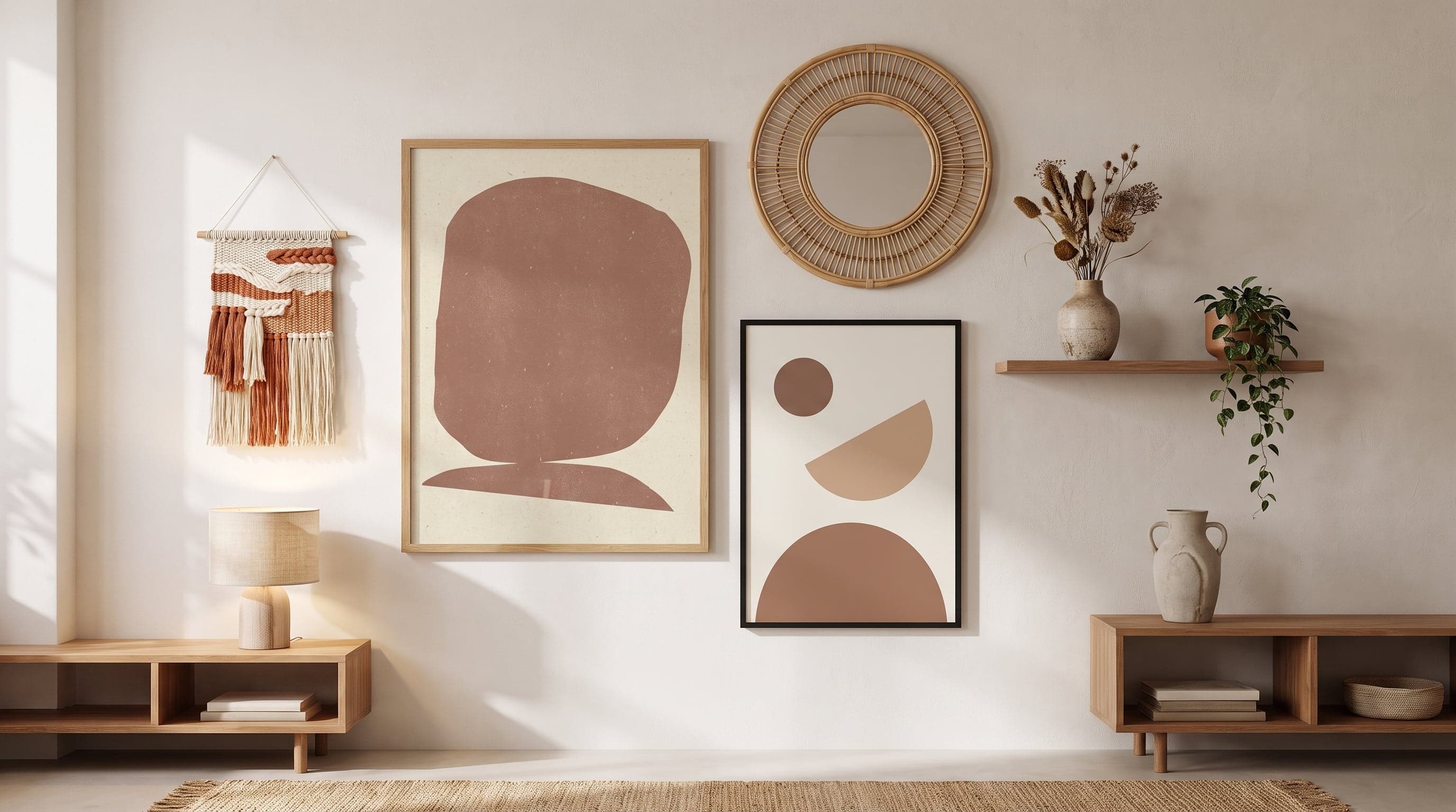
A gallery wall is rarely just a single image. It's a small visual language you build up – motifs that speak to one another, colours that echo, contrasts that make things stand out. Done well, it becomes almost like a portrait of you: what you collect, what you remember, what you long for.
The trouble usually starts when you buy a bunch of posters at once, lean them against the wall, and realise nothing quite fits together. It's rarely the taste that's off – it's the process. A gallery wall that works is built in stages: idea, palette, layout, and only at the very end – the hammer.
This guide walks through the whole journey, from your first choices of theme and mood to how you lay everything out on the floor before a single hole is drilled.
Find Your Starting Point: Theme, Feeling and Context
Before you pick a single motif, it's worth asking what you want the wall to do for the room. Should it calm things down, or bring energy? Do you want a cohesive, almost meditative surface – or a wall that tells several stories at once?
Many of the most successful gallery walls start from a single feeling rather than a strict theme. Earthy tones and organic shapes for anyone after something calm and japandi-inspired. Graphic patterns and sharp lines for anyone who likes contrast. Botanicals for anyone who wants to bring in something green and alive without the upkeep of actual plants.
Care of Posters brings together art from a wide range of illustrators, photographers and visual artists, making it easier to mix styles without compromising on quality – everything is printed using the same careful giclée technique on a matte, age-resistant Fine Art paper, whether the motif is abstract, photographic or classic.


Build a Palette That Ties It All Together
Colour is the simplest way to make a collection of different motifs feel like a whole. You don't need to choose the exact same shade in every poster – but if you stick to a shared base tone, such as warm neutrals, deep greens or soft pastels, it becomes easier for the eye to read the wall as a composition rather than a set of unrelated images.
Botanical motifs are a great example of how variation and cohesion can go hand in hand. A couple of different plant prints in a similar colour range – perhaps a looser, illustrative style next to something more classically restrained – can sit together without feeling overly on-theme.
- Start from a colour already in the room, not the other way around.
- Let a couple of posters be nearly monochrome – they act as resting points between more detailed motifs.
- Try placing your shortlisted pieces side by side in natural daylight before deciding – colour looks different at dusk than in daylight.


Plan Your Gallery Wall on the Floor Before You Pick Up the Drill
This is the step many people skip – and it's exactly why the gallery wall often doesn't quite come together. Lay out all your posters on the floor in the order and pattern you're considering. Step back, sit on the sofa, and look at it from the angle you'll actually be viewing the wall from in everyday life.
Do you want a strict grid layout or a looser, more organic composition? Both can work – but mixing the two principles on the same wall tends to make the result feel unfinished rather than intentional. Pick one logic and stick with it.
Kraft paper cut-outs or masking tape on the wall are an easy way to test the placement at real scale before you drill. Keep the spacing between each poster consistent throughout the whole composition – it's often this detail, more than the motifs themselves, that determines whether a gallery wall looks professional or scattered.
If you want concrete guidelines for sizes and spacing, it's worth reading more about the right sizes and spacing for your gallery wall before you commit to anything permanent.
- Use eye level as your reference point for the central or largest image.
- Factor in the furniture in the room – a gallery wall above a sofa or dresser needs to relate to its width.
- Take a photo of your floor layout before you take down the tape – it's easy to forget exactly how it looked.
Let Formats and Styles Vary on Your Gallery Wall – But Intentionally
A wall with only identical sizes and orientations risks feeling flat. Feel free to mix portrait and landscape formats, but do it with a clear idea in mind – for example, letting the largest, most detailed motif take centre stage while smaller formats frame it.
The same principle applies to style. A classic artwork rooted in turn-of-the-century painting can sit next to a graphic text poster without feeling disjointed, as long as the colour palette or mood ties them together. Contrast between eras and techniques is often what makes a gallery wall interesting to look at more than once.


Gallery Wall Room by Room – Same Principle, Different Expression
The core principles of a gallery wall – theme, palette, layout – apply regardless of room, but what actually works can differ. In the hallway, you meet visitors right away, and a gallery wall in the hallway often has the most impact with an architectural or photographic theme, such as city skylines that set the tone before anyone even steps inside.
In the living room, there's usually more space to work with, allowing for a larger composition with more contrast. In the bedroom, it often pays off to lean calmer – fewer, more cohesive motifs that don't compete with rest.
Regardless of the room, the principle stays the same: decide on the feeling first, then let your choice of motifs and sizes follow that logic rather than the other way around.


Frequently asked questions
- How many posters do I need for a gallery wall?
- There's no exact formula. As few as three well-chosen motifs can form a gallery wall, while larger spaces can carry considerably more. The more posters you use, the more important it becomes to tie them together with a clear colour palette or shared theme.
- Do all the motifs need to be in the same style for it to work?
- No, but they do need some kind of context – usually colour, shape or mood. A mix of, say, classic art and graphic text can work beautifully as long as something ties the whole look together visually.
- How do I know the right spacing between posters and furniture?
- It depends on the room's proportions and where the furniture sits, and it's worth going into in more detail if you want precise guidelines. As a starting point: keep the spacing between images consistent, and let the overall composition relate to the width of, say, the sofa or dresser it hangs above.
- Can I mix landscape and portrait formats on the same wall?
- Yes, and it often gives a livelier result than if every format is identical. Try out the composition on the floor first to see how the different formats balance each other before deciding on the final placement.