
How to Choose the Right Sizes and Spacing for Your Gallery Wall
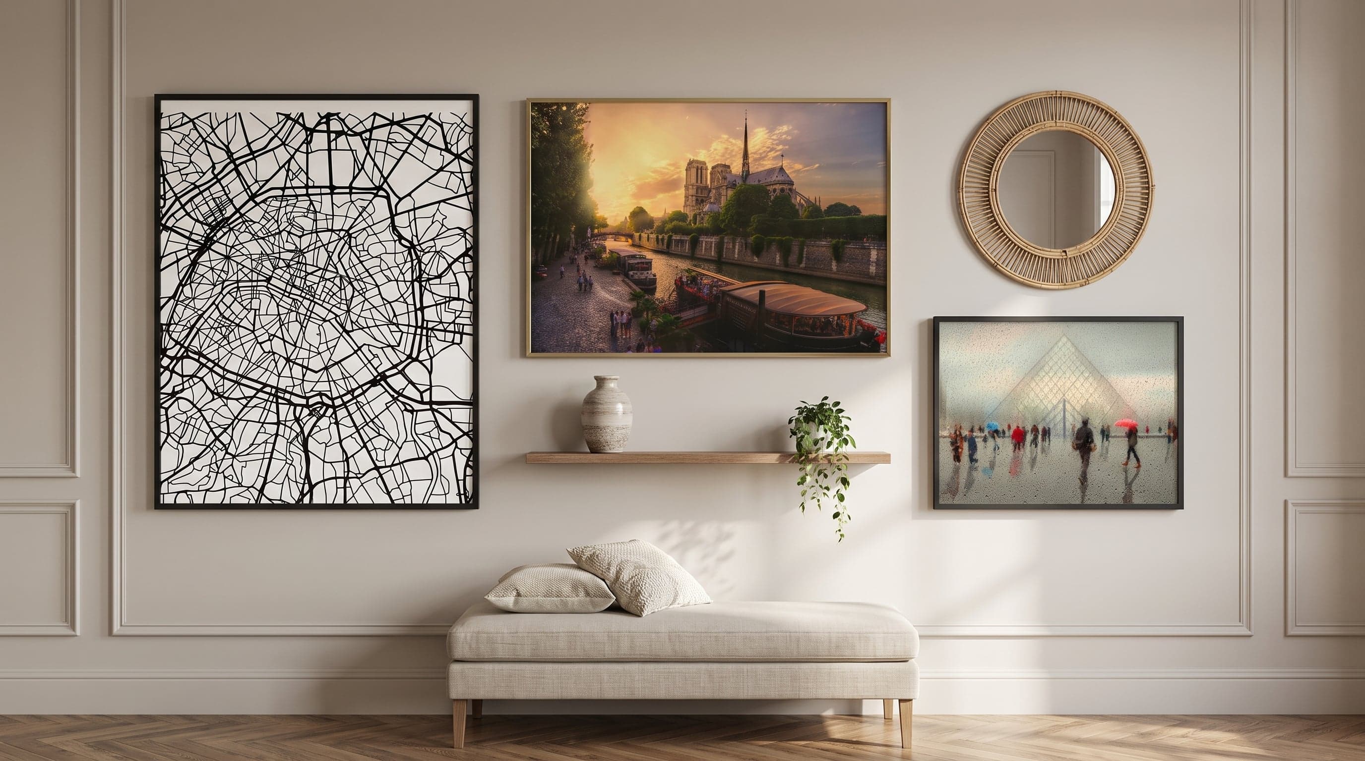
A gallery wall that works is rarely about finding the right motifs first. More often, it comes down to something less visible – the sizes and spacing of your gallery wall, the height from the floor, the relationship between the large and small formats. These are the details that decide whether a wall feels considered or just thrown together, and they can be worked out without turning into a maths problem.
Most of us have, at some point, hung a poster too high, placed it too close to another, or chosen a format that gets lost against a large wall. That's nothing unusual – it's hard to judge proportions before they're actually up on the wall. But there are a few simple rules of thumb, drawn from how interior designers and galleries actually work, that make the rest of the process far less uncertain.
Thinking in Sizes – From 21x30 to 70x100
Size isn't just about what fits on the wall, but about the role each poster is meant to play. A large format, like 50x70 or 70x100 cm, works as a statement piece in its own right – it rarely needs company to feel complete. Smaller formats, like 21x30 or 30x40 cm, find their strength in numbers instead, where several images together build a larger visual expression.
A common starting point is to let the largest format define the focal point of the composition, then build outward with smaller sizes in descending scale. This creates a natural movement for the eye, rather than everything competing for attention at once. Feel free to mix portrait and landscape formats – it's rarely uniformity in orientation that makes a wall interesting, but rather variation within a clear framework. If you want to see the whole process from idea to finished wall, there's a broader walkthrough in our guide to planning and creating a gallery wall.
- Let one large format carry the composition, and complement it with smaller sizes rather than the other way around.
- Avoid mixing too many different sizes within the same grouping – three to four formats is usually enough to create variety without looking cluttered.
- Consider the wall's proportions, not just the furniture beneath it. A narrow wall may call for a portrait format rather than a landscape one, regardless of what's standing in front of it.

Spacing Between Frames – Rules of Thumb That Work
The spacing between posters is usually the detail that decides whether a grouping feels cohesive or scattered. A common rule of thumb is 5–8 centimetres between frames – close enough for the images to read as one unit, but airy enough for each piece to breathe. Less spacing than that risks feeling cramped, while more spacing can easily make the grouping fall apart visually.
For larger formats, it can help to increase the spacing slightly, since the images already take up more room on their own. It's less about exact centimetres and more about the spacing feeling proportional to the size of what's hanging – a good benchmark is to let the margin between the frames be roughly half as wide as the margin around the entire grouping.
A simple way to test the layout before anything goes up on the wall is to lay the posters out on the floor, or cut paper templates to size and tape them up. This gives a sense of proportion that's hard to judge just by holding a single piece against the wall.
Eye Level and Placement in the Room – From Hallway to Living Room
A guideline used in gallery settings is to let the centre of the artwork land around 145–155 centimetres from the floor. That roughly corresponds to eye level for a standing viewer, and works as a solid benchmark at home too – especially for single pieces meant to be viewed from a distance, such as in a hallway gallery wall or above a chest of drawers.
In a grouping, the same principle applies, but to the midpoint of the whole composition rather than to each individual poster. This means the centre of the largest poster in a grouping often becomes the natural reference point for the height of the entire wall. If you spend a lot of time sitting in the room, as in a living room, it can be worth basing the height on seated eye level instead of standing – after all, art is meant to be looked at, not just to fill a wall.

Sizing the Wall to the Furniture – The Two-Thirds Rule
Above a sofa, bedside table or chest of drawers, there's a simple rule of thumb to work from: let the width of the artwork or grouping equal roughly two-thirds of the furniture's width. If the sofa is 220 centimetres wide, that puts you at a gallery wall of around 140–150 centimetres – enough to feel like a deliberate composition, without overwhelming the furniture below. For more examples of how this rule plays out in practice, see our guide to gallery walls in the living room.
The rule works just as well in reverse: if the wall space is narrow, it may be better to choose a narrower, portrait format rather than forcing in a wide grouping. A larger landscape format, like 70x100 cm, often looks great on its own above a sofa, while a tighter grouping of smaller formats can balance a narrower piece of furniture like a bedside table or writing desk – something covered in more detail in our guide to gallery walls in the bedroom.

Combining Different Formats in a Grouping
The hardest – and most enjoyable – part of a gallery wall is often getting different formats to work together. A common approach is to think in terms of a grid, where each poster is given its own space but aligns with at least one axis of its neighbour, either in height or width. This creates order without feeling rigidly symmetrical.
Square formats are particularly useful here, as they act as neutral building blocks between portrait and landscape posters. Placing a square format in the middle of a grouping with portrait and landscape pieces around it softens the transitions and gives the eye a natural pause between formats.
- Let a shared edge – top, bottom or centre line – tie together posters of different heights.
- Use square formats as a bridge between portrait and landscape images.
- Avoid mixing too many bold, colourful motifs within the same grouping if the formats already vary a lot – let either colour or shape be the element that creates calm.
Frequently asked questions
- How much space should there be between posters on a gallery wall?
- A common starting point is 5–8 centimetres between frames. This is a guideline rather than a strict rule – larger formats may need a bit more breathing room, while a tighter grouping of small posters often holds together best with minimal spacing.
- At what height should you hang a gallery wall?
- A common benchmark is to let the centre of the artwork or grouping land around 145–155 centimetres from the floor, which roughly corresponds to eye level. In rooms where you spend a lot of time sitting, such as by a sofa, it can be better to base it on seated eye level instead.
- How big should a gallery wall be above a sofa?
- A simple rule of thumb is to let the width of the wall arrangement equal roughly two-thirds of the sofa's width. This creates a composition that feels proportional without overwhelming the room.
- Can you mix different sizes and formats on the same wall?
- Yes, that's often what makes a gallery wall interesting. Let a larger format carry the composition and complement it with smaller sizes, and consider using a shared edge or centre line to tie together portrait, landscape and square formats.