
Living Room Gallery Wall – Ideas That Actually Work
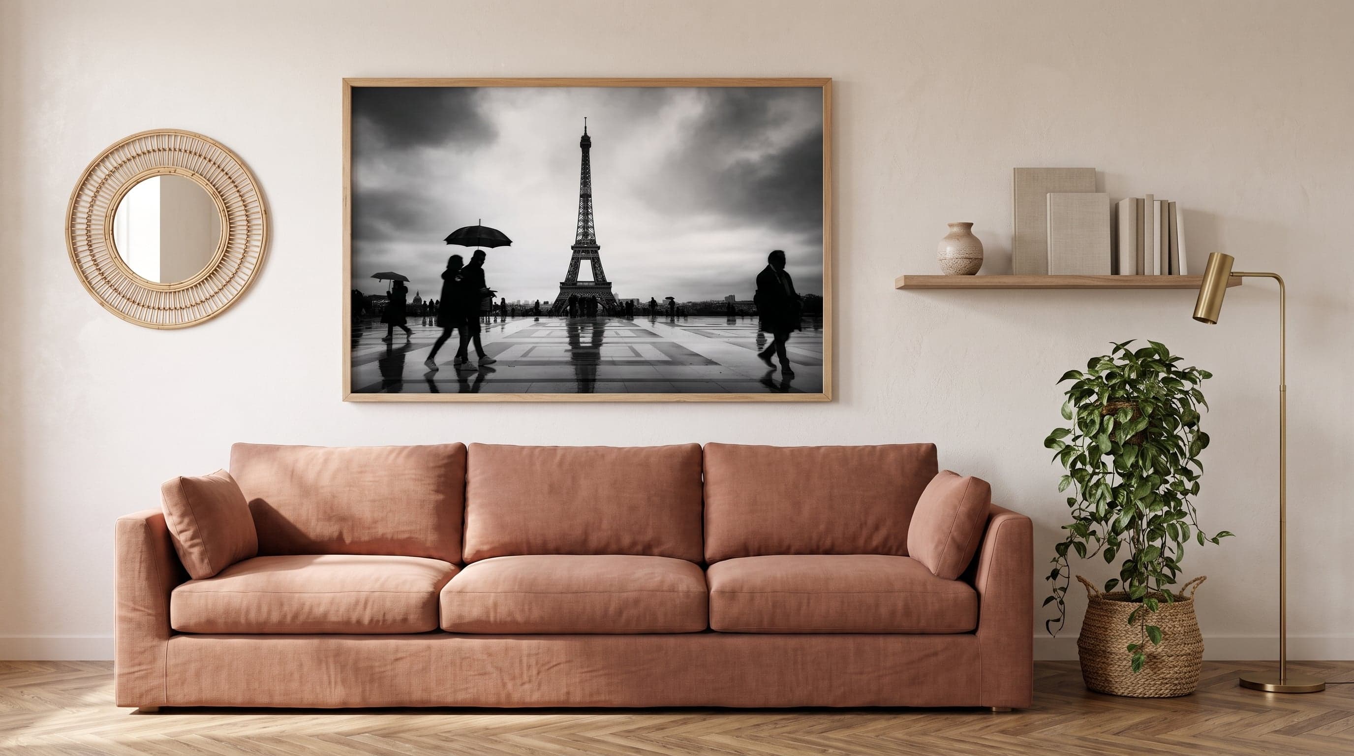
The living room is rarely a room you finish decorating. It keeps evolving as sofas get replaced, new furniture moves in, and guests come and go – and in the middle of it all there's usually a wall, often the one behind the sofa, waiting to become something more than just a backdrop.
Unlike the more intimate format of the bedroom or the narrow, transitional space of the hallway, the living room has its own logic entirely. There's room here for a bold statement, but also for mixed furniture styles, pieces passed down through generations, and a need for the room to work both for a quiet evening alone and for dinners with family and friends. A living room gallery wall that's meant to last needs to be approached a little differently.
It's not about following a template, but about understanding what the wall is actually meant to do in the room – draw the eye, balance the furniture, or give conversations something to land on. If you want to start with the basics, you'll find more in our guide to planning a gallery wall.
The Wall Above the Sofa – the Room's Quiet Leading Role
In most living rooms, the sofa wall is the surface that takes up the most space and gets the most attention, yet it's easy to keep putting off decisions about it. There are rarely shelves or doors in the way here, which means you can actually think bigger than you might expect.
A single large piece often works better than you'd think above a long sofa – it gives the eye a direction to follow instead of splitting attention between several smaller elements. A landscape with depth, like a river scene painted in thick acrylic brushstrokes, can fill the space without feeling overpowering. Architectural cityscapes in black and white work in a similar way: their strong lines hold large formats together without becoming overwhelming.
- A single large-format piece in the centre creates calm rather than spectacle
- Landscapes and architecture often have the sense of depth needed to fill a large surface
- The colour palette of the artwork should reflect the room's light – cooler tones in north-facing light, warmer tones in rooms with plenty of evening sun

Big Meets Small – Composing a Gallery Wall That Breathes
Living rooms rarely have just one wall to fill – there's often a side wall, a spot by the window, or a narrow strip beside a bookshelf that also wants some attention. This is where square formats become a great tool, since they create rhythm without demanding as much floor space as one large horizontal piece.
Combining a few smaller, square prints in a row – ideally with a shared theme like botanicals or simple graphic shapes – gives a wall that feels composed rather than thrown together. A black-and-white square nature print, for example, could be balanced against a more abstract shape in beige and brown, so the scale varies while the palette stays cohesive.
It's in this kind of grouping that you often find the best living room gallery walls: not one single hero piece, but a collection that invites the eye to wander. If you're working out exact measurements and spacing, it's worth reading more about the right sizes and spacing before you start hanging.
Art for the Living Room, Where Everyone Gathers
The living room is often the only room in the home where different generations, guests, and everyday routines meet at the same time. That makes it an environment where art is allowed to have a bit of attitude – something that sparks a question or a comment, rather than simply blending in.
Abstract art with a strong character works particularly well here. Soft, almost meditative compositions can give the room a calming counterbalance to the everyday hustle, while more expressive pieces with bold blocks of colour bring energy to a sofa arrangement that might otherwise feel neutral. An abstract portrait in warm colours can also work as a kind of focal point near an armchair or reading nook, without competing with what's happening at the centre of the room.
These aren't pieces you typically choose to be discreet – rather, you choose them because they give the room something to talk about.
When Furniture Doesn't Match – Let the Art Tie the Styles Together
Few living rooms are decorated in a single style throughout. The inherited sofa, the newly bought coffee table, and an armchair from a completely different era often share the same room – and that's not a problem, as long as the wall helps tie it all together.
A classic piece, like a turn-of-the-century painting with gold tones and organic lines, can act as a bridge between older furniture and more modern elements. Graphic black-and-white botanical prints, drawn from an older craft tradition, have a similar effect: they feel timeless enough to work both beside a worn leather sofa and next to sleeker, modern furnishings.
Often, it's enough to let a couple of pieces share the same black-and-white or warm tonality for the whole wall to feel like a deliberate choice rather than a compromise between different furniture legacies. Choosing prints without a white border makes the cohesion even clearer, while a border gives each piece a bit more breathing room when the styles otherwise differ.
Frequently asked questions
- How high should artwork hang above a sofa?
- A common starting point is to let the bottom edge of the artwork or grouping sit roughly 15–20 centimetres above the back of the sofa, so the piece feels connected to the furniture rather than floating freely on the wall.
- How many pieces of art suit a space above a sofa?
- It depends on the width of the sofa and the format of the artwork. A single large piece often works best above a long, straight sofa, while a sofa with more depth and less width can carry a smaller grouping of three to five pieces.
- Can you mix different art styles on the same gallery wall?
- Yes, as long as there's some common thread – for example, colour palette, paper tone, or whether all the pieces have or lack a white border. It's details like these that make a mixed wall feel cohesive rather than scattered.
- What size works best in a large living room?
- In rooms with high ceilings or large wall surfaces, it's easy to underestimate how big a piece of art can be. Larger formats, ideally from 50x70 cm and up, often create a calmer impression than several smaller pieces scattered across the same space.