
Bedroom Gallery Wall – Creating a Calm, Personal Feel
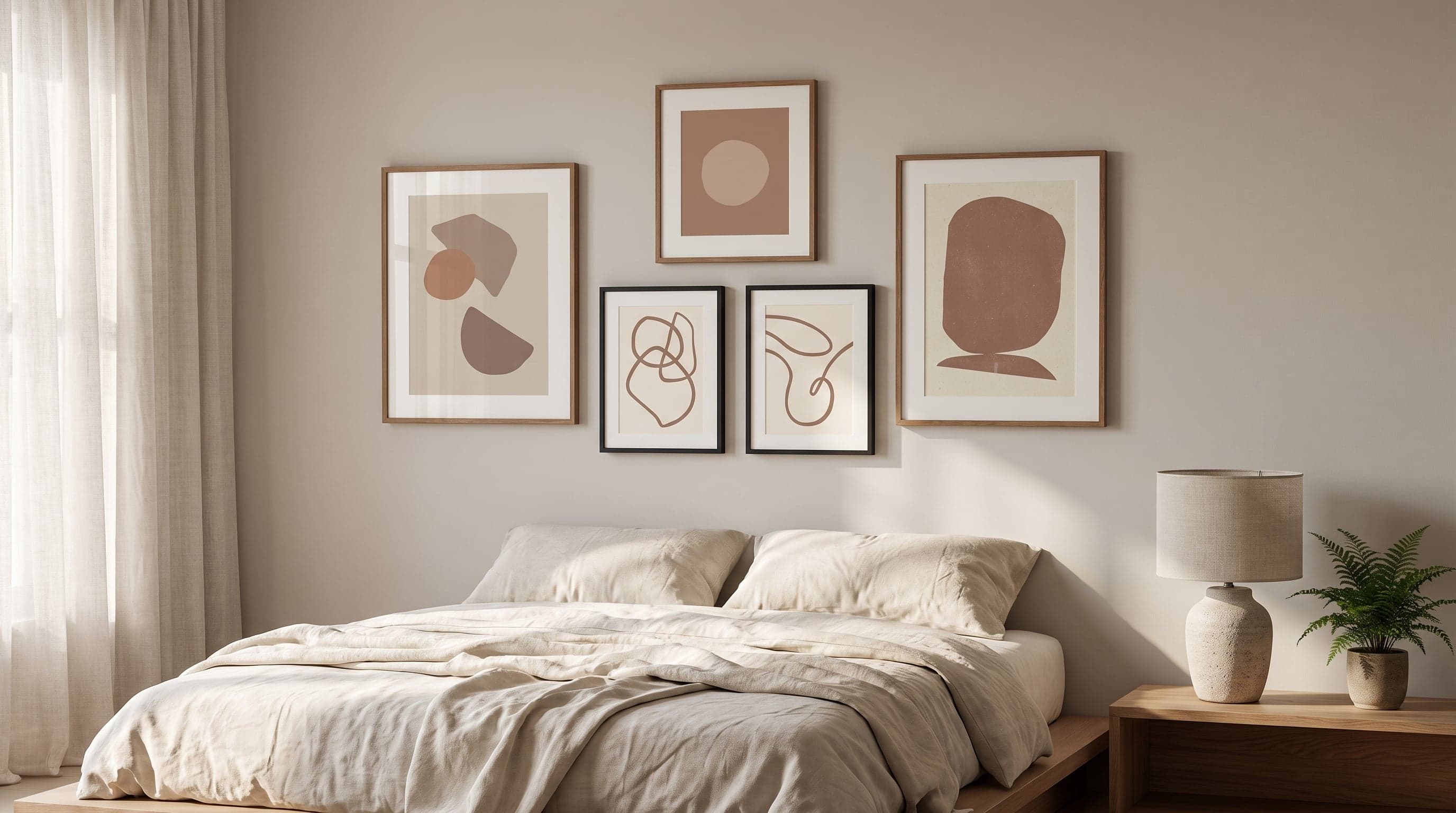
The bedroom is the one room in the home where your eyes should actually get to rest. Yet it's often here that we gather the most personal items – travel photos, art prints, mementos from different chapters of life – without much thought for what the eye meets right before it closes for the night. A gallery wall in the bedroom is less about display and more about creating a surface to settle into.
The difference from a gallery wall in the living room is significant. There, contrasts and surprises are welcome, drawing the eye in. In the bedroom, the task is the opposite: to compose something that lowers your pulse rather than raises it. This calls for different choices in motif, colour temperature, and just how much the wall should actually say. If you want to start from the basics – placement, sizes and composition – there's a broader guide to planning your gallery wall to build on.
The wall above the bed is the one you see most – from the doorway, from the other side of the bed, in mirrors and in photos. Much like a gallery wall in the hallway, where the first impression sets the tone, this is where the eye first meets the room – though the goal here is the opposite: to let it rest, not wake it up. This wall therefore deserves more thought than any other surface in the room.
The Wall Above the Bed – the Room's Quiet Focal Point
Above the bed, a piece of art – or a pair of them – functions almost as an extension of the headboard. The motif sits still in your peripheral vision all night long, becoming part of the room's background hum, whether you're looking directly at it or not. That's why it pays to choose something that doesn't demand attention – but rather yields to it.
Soft, brushstroke-like forms in muted tones often work better here than sharp contrasts or highly detailed motifs. A single larger piece, or two that balance each other symmetrically, gives the calm a clear shape without feeling bare.


A Muted, Earthy Colour Palette for the Bedroom
Colour does more for a bedroom's atmosphere than most people realise. Bold hues and high contrast activate the eye in a way that suits rooms meant for alertness and presence better than one meant for rest. In the bedroom, a palette drawn from earth, sand and burnt clay works differently – it adds depth without shouting, leaving room for the rest of the space's textiles and light to take the lead.
Abstract lines in beige and mocha tones can be combined in multiples without feeling cluttered, precisely because the palette is so cohesive. Think of them as variations on a theme rather than separate works – which makes it easier to hang three or four pieces on one wall without losing the overall sense of calm.


Botanical Motifs That Soothe Rather Than Stimulate
Plant motifs have long been associated with calm, but not all botanical prints work equally well in the bedroom. A dense, brightly coloured floral print can feel just as lively as it does soothing. The motifs that work best here tend to be more graphic – simple lines, muted tones, plenty of white or beige space around the shapes. Foliage and flowers then become breathing space rather than eye-catchers.
A pair of such prints side by side, in the same shade but with different motifs, adds variation without breaking the mood. It's a simple way to bring botany into the room without letting it take over.


Composition: Space, Symmetry and Restraint on the Gallery Wall
The most common pitfall with a bedroom gallery wall isn't the wrong motifs – it's too many of them. A wall meant to support rest benefits from empty space – the margin around the artworks matters just as much as what's hanging on them. A few extra centimetres of air between the frames often does more for the sense of calm than one more print. If you want to work this out more precisely, there's a rundown of the right sizes and spacing for different walls.
Symmetrical hanging, with an even number of pieces centred above the bed, gives a stable and predictable impression – exactly the feeling you want to drift off to. If you want to break things up with a more asymmetrical composition, it works best on a side wall, not above the headboard, where the eye would otherwise never quite get to rest.
Try to stick to one or at most two image orientations and a consistent colour temperature across the whole wall. It's the single easiest way to achieve a gallery wall that feels considered rather than thrown together.
Frequently asked questions
- How many pieces of art should you have above the bed?
- One or two larger pieces usually work best above the bed – they create a clear focal point without feeling cluttered. If you want more, keep them within the same colour palette and evenly spaced.
- Which colours work best for a bedroom gallery wall?
- Muted, earthy tones like beige, sand and mocha tend to feel calmer than bold contrasting colours, which suit rooms meant for wakefulness and alertness better.
- Can you mix abstract and botanical motifs on the same wall?
- Yes, as long as they share a colour palette and overall expression. It's contrast in mood – not in motif – that makes a wall feel disjointed.
- Should the artworks be placed symmetrically above the bed?
- Symmetrical hanging centred above the headboard usually gives the calmest impression. Asymmetrical compositions work better on a side wall in the room.