
Gallery Wall in the Hallway – First Impressions Count
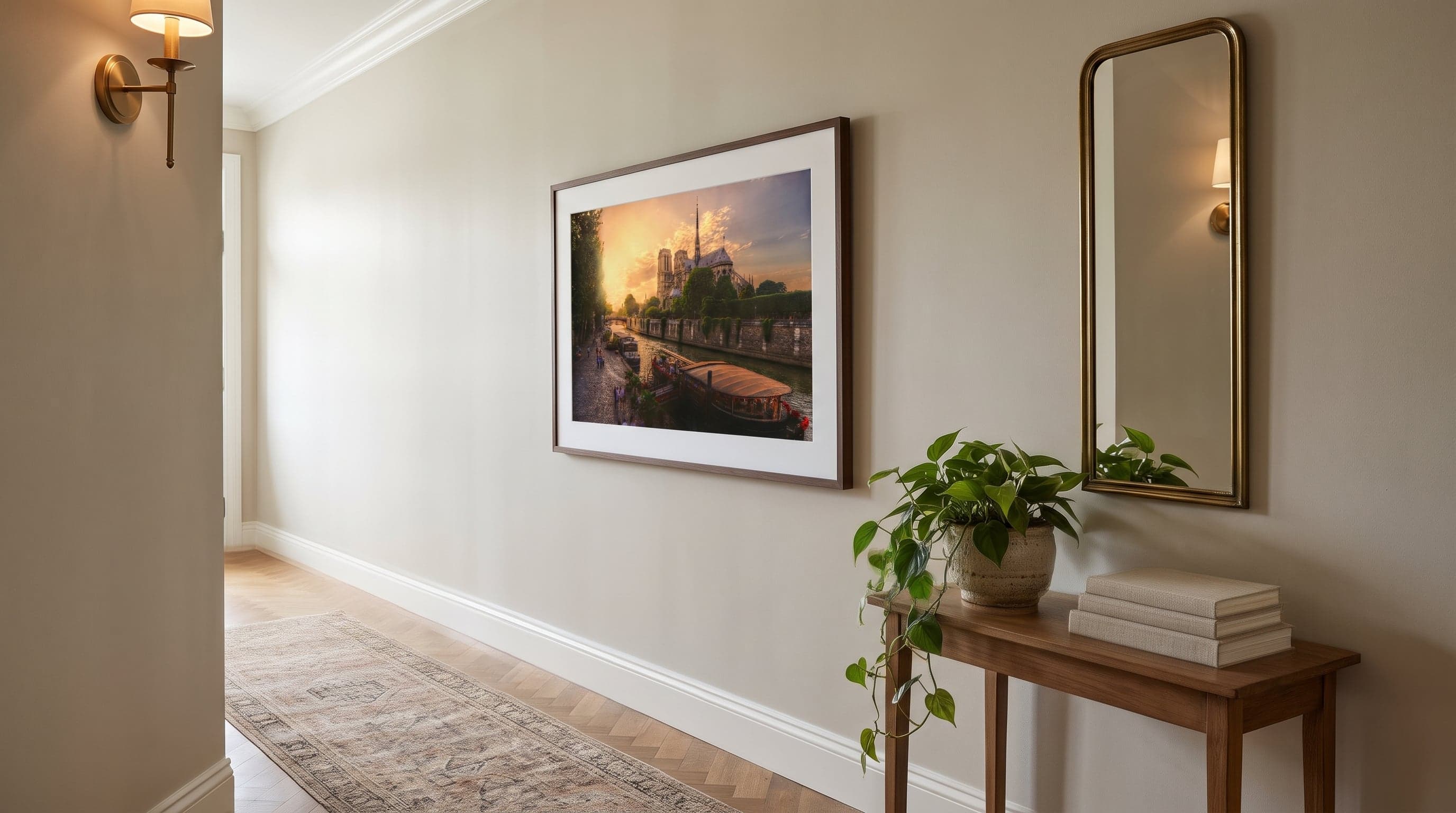
The hallway is the room we spend the least time in but see the most – on our way out, on our way in, in passing as we hunt for our keys. Perhaps that's exactly why it's so often overlooked when it comes to decorating, despite setting the tone for the entire home. A gallery wall in the hallway is one of the easiest ways to give your entrance personality without much effort at all.
The challenge, of course, is that hallways are rarely generous with space. Narrow walls, low ceilings, doors and closets eating into the available area – that's the reality for most of us. But a narrow gallery wall doesn't have to mean a limited one. With the right formats and a thoughtful composition, even a corridor wall just 60 centimetres wide can carry a display that feels every bit as considered as one in a spacious living room.
Here we'll walk through how to plan a hallway gallery wall based on the conditions you actually have to work with – narrow surfaces, long corridors, and that fleeting first impression that shapes how the whole home is perceived. If you'd like to dive deeper into the full process, from idea to installation, take a look at our guide to planning a gallery wall.
A Narrow Gallery Wall – Think Vertical, Not Wide
In a narrow hallway, height is often your best friend. Where a wide wall invites several posters side by side, a narrow wall works better with portrait formats stacked upward. Think a single column, or two placed close together, rather than a broad spread.
Portrait motifs with a strong composition work especially well here, as they reinforce the sense of height rather than breaking it up. A portrait-format piece like Vincent Van Gogh's cypress motif or an architectural print such as Rouen Cathedral gives the eye something to travel along, up and down, rather than side to side.
A good rule of thumb: hang the top poster at roughly eye level for someone walking past, rather than someone seated. After all, a hallway is a room you move through, not one you sit in.
- Choose 21x30 or 30x40 cm for narrow hallways – larger formats can feel overwhelming on a tight wall
- Keep the spacing between posters consistent for a tidy, considered look
- Let a shared colour palette tie the motifs together even if the subjects differ
A Vertical Series Brings Calm to the Corridor
A simple trick for narrow walls is to choose a series of posters that belong together – same artist, same theme, same style – and hang them in a straight column. This gives you a cohesive look without having to work out a complicated composition, and it's particularly well suited to hallways, where there's little room for improvisation.
Abstract series with a recurring visual language, such as Kandinsky's "Kleine Welten" suite, are a great example. The motifs differ in detail but share a colour scale and mood, which means they can be hung close together without competing with one another. The result is a wall that feels curated rather than thrown together.
Keep the gaps between frames small – 5 to 8 centimetres tends to work well in a narrow column – so the series reads as a single whole rather than separate pieces. The same principle applies in other rooms of the home too – take a look at how we approach a living room gallery wall if you'd like to compare approaches.
Creating Movement Along a Long Wall
If you have a long but narrow corridor instead, the challenge is different: avoiding a wall that feels like an endless row of identical squares. Here it's about creating movement – variation in height, a rhythm to the placement, and ideally motifs that draw the eye forward through the space.
One approach is to mix landscape and portrait formats in a loosely repeated rhythm along the wall, rather than a perfectly symmetrical row. Architectural motifs, such as a city skyline or a cathedral, work well as recurring anchor points, since they each have a clear horizon to relate to.
Consider letting posters with similar but not identical compositions – different cities or buildings, for instance – create a sense of journey along the wall. This gives the corridor a sense of direction, which feels natural given that it's a space you actually walk through.
- Vary the height slightly between each poster for a more organic feel
- Keep the spacing between posters even, even if the sizes differ
- Avoid hanging too high up – in a corridor, the wall is seen up close


Give the Hallway a Personal Touch Without Overdoing It
A hallway gallery wall doesn't need to be strictly symmetrical to feel well thought out. Botanical motifs with simple, graphic lines are a tasteful way to soften an otherwise fairly formal architectural or abstract wall, especially if the rest of the hallway is sparsely furnished.
Stick to no more than two or three motif themes within the same display – architecture and botanicals, for example – so the wall feels curated rather than random. Black-and-white or natural-toned motifs often work best in hallways, since these spaces rarely get much natural light and benefit from calm, bright visuals.
Keep in mind, too, that a hallway is often seen in quick passing – from the side, on the way through. Motifs with clear outlines and simple compositions read better at that pace than highly detailed or brightly coloured pieces. If you'd like to create a similar feel in another room, our guide to a bedroom gallery wall offers more ideas for calm, cohesive looks.
Frequently asked questions
- What size works best for a narrow hallway gallery wall?
- In tight hallways, smaller to medium formats like 21x30 or 30x40 cm tend to work best, especially in vertical layouts. Larger formats can be used if the wall has plenty of height, but avoid wide posters that take up too much horizontal space on a narrow wall.
- Should hallway posters have a white border or not?
- It's a matter of taste, but a white border can make a tightly spaced vertical display feel a bit airier, which is often appreciated in narrow spaces. Without a border, the motif becomes more dominant, which suits a bold, striking feature wall.
- How many posters should you use in a long corridor?
- It depends entirely on the length of the wall, but it's better to use fewer posters with some breathing room between them than to pack the wall full. Let the motifs breathe so each poster stands out on its own while still forming a cohesive whole together.
- Can you mix different motifs and styles on the same hallway gallery wall?
- Yes, as long as there's a common thread – such as colour palette, format, or theme – tying the look together. Without that connecting thread, the wall risks feeling disjointed, especially in a small space like a hallway.