
With or Without a White Border – How Margins Transform Artwork
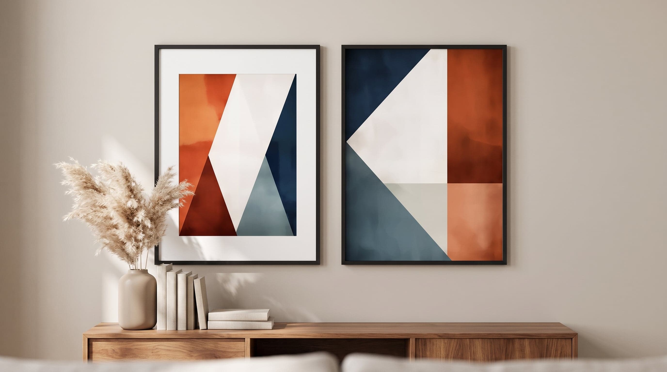
It's easy to think of the white edge around an art print as empty space – something left over when the motif doesn't cover the whole sheet. But the border is rarely accidental. It's a gesture, a way of telling the eye where to rest before it meets the image.
Throughout the history of photography and printmaking, the white border has long been a way of presenting work with a certain respect: giving a photograph or an etching space to breathe before the viewer's eye reaches the lines themselves. The same principle still governs the choice between an art print with a margin and one that runs edge to edge.
It's rarely a matter of right or wrong, but rather what you want the wall to communicate. A spare, linear drawing often benefits from air around it, and here a poster with a white border is often the clear choice. A saturated, dense composition, on the other hand, tends to lose its power with too much white space.
The Border as a Pause for the Eye
Think of the border as a pause in a sentence – it gives the eye time to land. A motif with a white margin invites the gaze to first register the edge, then the image, in a movement more akin to reading a page of text than taking in a photograph all at once.
This is why strictly graphic or geometric motifs often thrive with a border. The shapes are allowed to stand free from the wall's surrounding structure, almost as if they rested in a room of their own within the room.


A Legacy from the History of Print and Photography
The convention is older than you might think. When photographs and technical drawings were presented and preserved throughout the 19th and 20th centuries, they were often mounted with a wide white border around the motif – partly for practical reasons, such as space for notes and handling without touching the image surface, and partly because the border served as a visual pause between the technical and the decorative.
Patent drawings are a clear example. The lines are precise, often rendered in blue or black against pale paper, and need air around them so the details can be read at an unhurried pace. The same logic applies when such drawings are printed as giclée art prints today – the border isn't decoration, it's part of how the image was originally meant to be read.


The Natural History Plate and Its Generous Border
Botanical illustrations carry a similar tradition. In herbariums and scientific plates, the plant was rarely given the whole sheet – a wide margin around leaves and flower signalled that the motif was worth studying on its own, set apart from everything else on the page. The white surface became a kind of respect for the subject depicted, a way of letting the flower speak without competition.
When roses from older botanical plates are printed today with the same generous border on Fine Art paper, it's this same sensibility being reused: the motif is allowed to stand on its own, without competing with the rest of the wall's expression.


When the Motif Wants to Fill the Whole Surface – Posters Without a Border
The border is no universal answer. Some images lose their tension if given too much air – a portrait with a strong presence, or a composition built on rhythm and contrast, often benefits from running right to the edge. Then the image surface and the paper surface become one and the same, and the eye meets the motif with no gap to slow it down.
It's a different kind of intensity: less contemplative, more immediate. A gold-shimmering Art Nouveau-style portrait or a dense, graphic black-and-white composition sometimes needs exactly that tight, borderless frame to keep its tension on the wall – whether you choose to call the result a poster, print or artwork.


Frequently asked questions
- What's the actual difference between a border and a mat/passe-partout?
- The border is printed directly onto the art print and is a permanent part of the sheet, while a mat (passe-partout) is a separate piece of card added during framing. Both create a similar visual distance between motif and frame, but the printed border stays with the image regardless of how it's later displayed.
- Does a white border suit every motif?
- Not necessarily. Motifs with strong colour saturation or compositions that already fill the entire image area tend to work better without a border, while graphic, linear, or lighter motifs often benefit from the extra air around them.
- How do I choose between a border and full bleed if I'm unsure?
- A simple rule of thumb: the more a motif already breathes on its own – light paper, plenty of negative space – the less it needs a border. The denser and more high-contrast the motif, the more a border can help the eye find rest.
- Does a border change how large a poster feels on the wall?
- Yes. A poster with a border often feels somewhat smaller than its physical dimensions, since part of the surface is given over to white space. The same size without a border feels fuller and more present in the room.