
Fine Art Paper – Why the Paper Matters More Than You Think
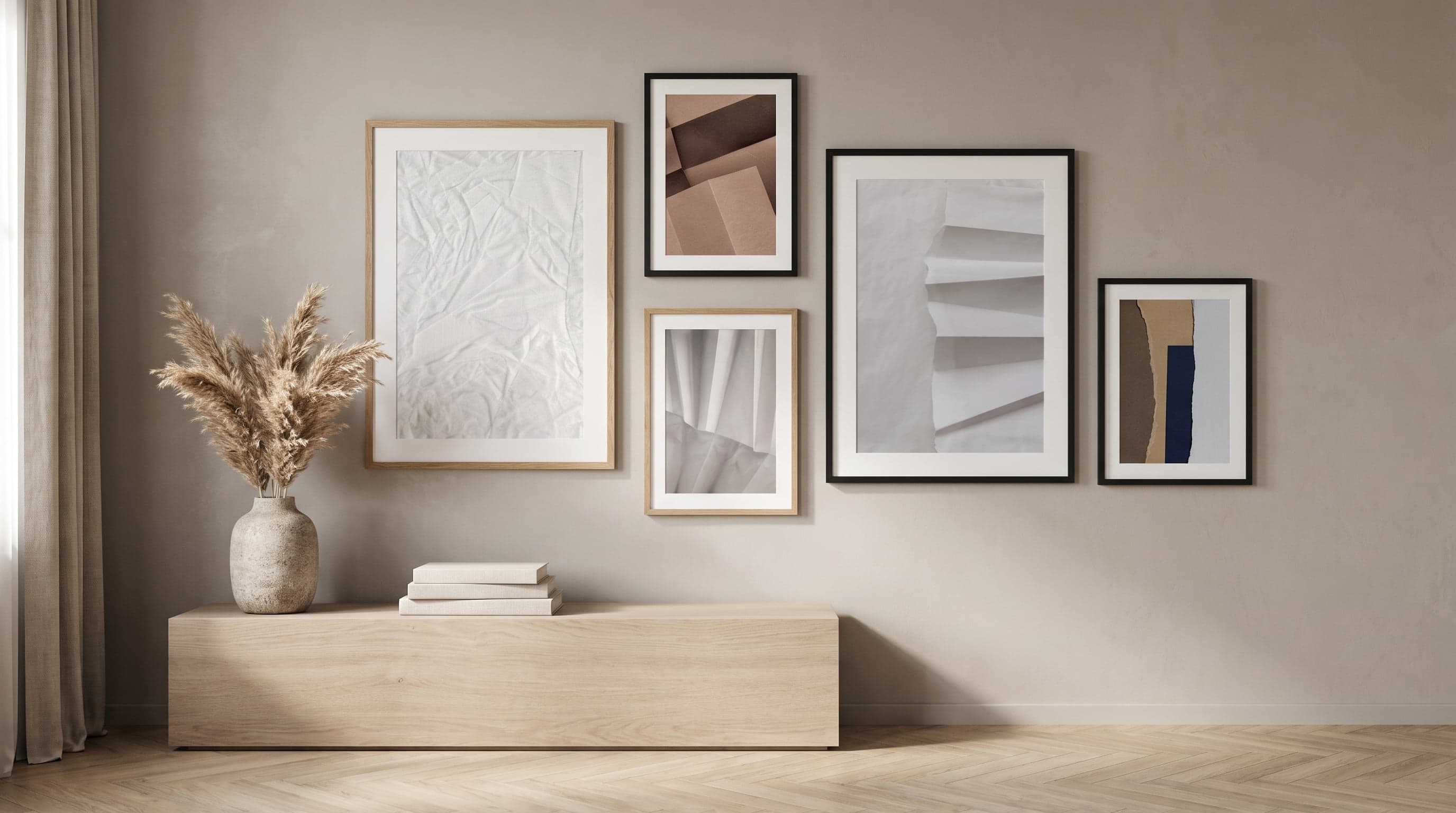
An art print rarely looks the same in the shop as it does at home on the wall. The light changes throughout the day, your eye meets the surface at a different angle, and suddenly you notice just how much the paper actually contributes to the experience – not merely as a carrier of the image, but as an active part of how colour, depth and detail are perceived by the eye.
It's easy to think of print quality purely in terms of pigment and resolution. But the paper matters just as much. Its surface determines how light bounces off it, its weight how the image feels beneath your fingers, and its composition how long the colours stay vibrant without yellowing or fading. If you'd like to dig deeper into what really defines quality, you can read more in our guide to the fundamentals of art prints.
At Care of Posters, every poster is printed using twelve-colour giclée on a 200gsm Fine Art paper, FSC-certified and with a smooth, matte finish. The choice of paper is not a marginal detail – it's a prerequisite for how the artwork will be experienced, today and in ten years' time.
The Light That Colours the Image
Every paper surface handles light in its own way. A glossy photo paper reflects light directly and sharply – great for making colours pop at first glance, but it also means you often see your own reflection or the room's lighting before you see the artwork itself. A matte surface diffuses light instead of bouncing it back, allowing the eye to move across the image without being interrupted by glare. The difference is most noticeable in rooms with large windows or spotlighting, where a print needs to be viewed from several angles throughout the day.
This is why abstract motifs with subtle transitions – crumpled surfaces, soft interplays of shadow, torn paper edges – work especially well on a matte surface. The almost imperceptible shifts in greyscale and texture would otherwise risk being lost in a glossy glare.


A Matte Finish – A Deliberate Choice, Not a Compromise
In the world of printing there's both glossy and matte paper, and historically they've served different purposes. Glossy paper is often associated with photography and magazines, where saturated colours and sharp contrast are meant to catch the eye quickly. Matte paper has long been the first choice for fine art printing and archiving, because the surface doesn't compete with the motif – it lets the image speak for itself, without glossy reflections that change character depending on where you're standing in the room.
Care of Posters prints exclusively on a smooth, matte Fine Art surface. This isn't a stopgap while waiting for an alternative – it's a deliberate stance: matte paper renders nuances and greyscales with greater calm, and it ages without yellowing or developing the slightly plasticky feel that glossy surfaces sometimes acquire over time.
The Importance of a Heavy Fine Art Paper
At 200gsm, the paper is heavy enough to feel like a material in its own right rather than a loose sheet – it has body, a certain stiffness that keeps it lying flat without curling at the edges. The weight also matters optically: a thinner paper can show through under strong backlighting or absorb moisture at different rates across the sheet, which over time creates unevenness in the surface. Whatever you call it – poster, print or artwork – the difference often comes down to material and context – it's the paper that determines how long the image keeps its lustre.
The paper being FSC-certified is about the origin of its fibres – that the pulp comes from forestry managed with care. It's part of the same overarching philosophy behind choosing a paper meant to last decades rather than years: sustainability in two senses, both for the environment and for the artwork.


The Giclée Technique Demands the Right Surface
Giclée printing is built on using twelve colours instead of the four found in a standard home printer – a technique you can read more about in our guide to the giclée process that changed how we print art. This delivers a significantly wider colour range and finer transitions between shades – but only if the paper can receive the pigments without them bleeding or bouncing back as glare. A matte, well-prepared surface absorbs colour evenly across the entire sheet, which means subtle tones – in, say, a marbled texture or a crumpled paper surface – actually remain visible, rather than flattening into a single shade of grey.
It's in the meeting of technique and material that the richness of detail emerges: the technique sets the bar, but it's the paper that determines whether that bar is reached.


How Fine Art Paper Stands the Test of Time
An art print that hangs on the wall year after year is exposed to the same light, the same humidity, the same dust as everything else in a home. An age-resistant paper is made to withstand that – without yellowing, cracking or losing contrast. It comes down to acid-free pulp and stable pigments that don't break down under light at the same rate as cheaper alternatives.
Over time, it becomes clear why the choice of paper was made in the first place: a matte surface that doesn't reflect the afternoon sun, a paper heavy enough not to curl, a process that keeps the colours intact long after the print has left the shop.


Frequently asked questions
- What's the difference between matte and glossy paper for art prints?
- Glossy paper reflects light sharply and gives a high-shine feel, while matte paper diffuses light so that colours and details remain visible from any viewing angle. In fine art printing and archiving, matte paper is the more common choice because its surface doesn't compete with the motif through glare. Care of Posters prints exclusively on matte Fine Art paper.
- Why do some posters turn yellowish over the years?
- This usually happens because the paper pulp contains acid or lignin that breaks down under light and air over time. An age-resistant Fine Art paper is manufactured to avoid this process, meaning its whiteness and contrast last considerably longer.
- Does paper weight (gsm) matter for how an art print feels?
- Yes – a higher weight, such as 200gsm, gives the paper enough sturdiness to lie flat and feel like a material in its own right rather than a thin sheet. This affects both the tactile experience and how evenly the colour sits on the surface.
- Does matte paper suit both light and dark motifs?
- Yes. Matte paper renders both subtle pastel tones and deep, dark contrasts without the surface reflecting away the details. This is one of the reasons the technique works equally well for photographic motifs as it does for abstract art.