
Graphic Portraits – When the Face Becomes Form
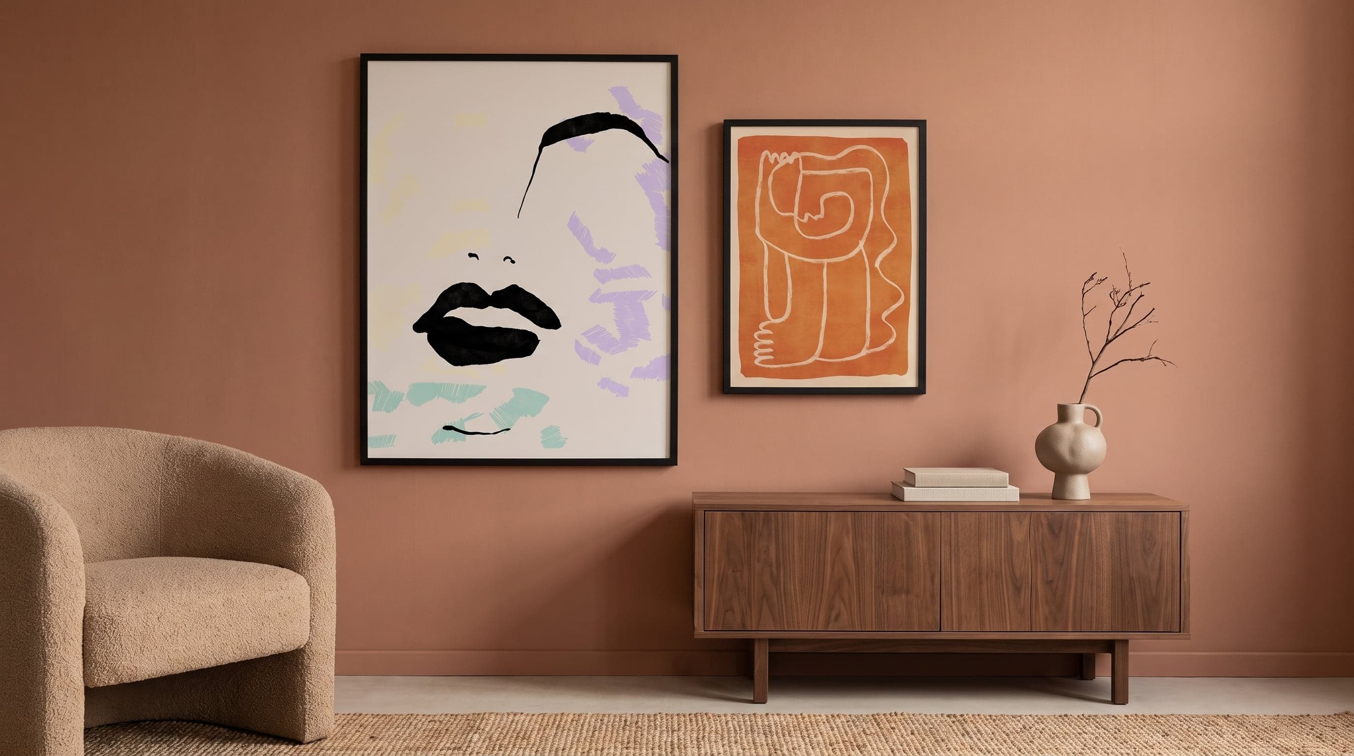
A face no longer needs to look like a face for us to recognise it as one. A pair of eyes is suggested with two strokes, a nose becomes a curve, a cheek a field of terracotta or blue. That's enough. The brain fills in the rest, and it's precisely in that gap – between what is shown and what is merely implied – that much of contemporary visual culture is currently situated, within the broader field of figurative art.
A graphic portrait poster borrows as much from the clarity of poster art and the economical visual language of graphic design as it does from the history of portrait painting. The result is images that feel both modern and strangely timeless, as if they had always existed but have only now found a context to belong in.
The Line as Portrait
The most reduced variant of the genre is also the most disarming: a face drawn with a single unbroken line, or a handful of carefully chosen strokes that form eyebrows, nose, mouth. Nothing is superfluous. Line portrait art of this kind is about trusting the viewer's eye – giving as little as possible while still conveying a whole character, a temperament, sometimes even a mood.
There's something of calligraphy's confidence here. A hesitant line is immediately visible, which means that these works, despite their simplicity, demand striking precision from their creator. The tension between the sparse expression and the technical sharpness is a large part of the appeal.


Geometry Takes Over the Face
Where the line portrait works with a minimum, the geometric variant builds the face as a construction of shapes – triangles, circle segments, overlapping planes in different shades of the same colour. Here the kinship with Cubism's fragmentation is most evident, but without its unease. The geometric portraits dominating right now are, if anything, calm – almost architectural in their construction.
The face becomes a composition rather than a depiction, divided into fields that could exist detached from their context and still be understood as parts of a face. It's a balancing act that requires the artist to understand exactly how much structure a form can bear before recognition is lost.


Colour Fields Instead of Features
A third direction abandons the outline almost entirely and lets colour itself carry the form. A face emerges through a few large, flat fields – a shadow in deep blue, a skin tone in ochre, a background that merges with the subject. It's a technique that draws more from poster art's tradition of bold, clear surfaces than from portrait painting's play of shadow and transition.
What makes these works compelling is how little is actually needed to create a sense of gaze, of direction, of an inner life. A single darker field where an eye should be is often enough to make the whole composition feel alive.


A Visual Language with Historical Roots
Reducing the face is not a new idea. During the interwar period, Picasso, among others, experimented with portraits drawn in a single continuous line, a way of exploring how little was needed for a drawing to read as a human feature. The Bauhaus school was simultaneously grappling with similar questions within graphic design – how geometry and typography could communicate with the same force as a traditional motif.
The contemporary graphic portrait brings these two threads together. It is as much a child of design history as of art history, and this dual lineage is part of why the style feels so current: it speaks equally to those who grew up with posters and screens, and to those who recognise the references to an older tradition of painting.


Living with a Reduced Face
What makes these images unusually generous in a room is precisely their openness. A photographic portrait points to a specific person, a specific story. A graphic portrait remains an allusion – a silhouette, a soft contour, a field of colour that can be read again and again without ever fully revealing itself.
In a collection featuring several works, a dialogue easily arises between the different degrees of reduction: a strict line portrait next to a softer colour field, a geometric composition beside a more fluid silhouette. It recalls how the tradition of female portraits in art has continually been reinterpreted through new visual languages without losing its core. It's a visual language that rarely shouts, but just as rarely fades into the background.


Frequently asked questions
- What characterises a graphic portrait?
- The face is reduced to its most essential elements – lines, geometric shapes or simple colour fields – rather than being rendered with realistic detail and shading.
- What's the difference between a line portrait and a geometric portrait?
- A line portrait is built from a handful of continuous strokes, while a geometric portrait is constructed from overlapping shapes and colour fields that together form the face.
- Do graphic portraits work well alongside other motifs on a wall?
- Yes, because the style is so pared-down, it often works well together with both abstract art and more figurative or photographic motifs in the same room.