
Posters in the Small Bathroom – Composition When Wall Space Is Scarce
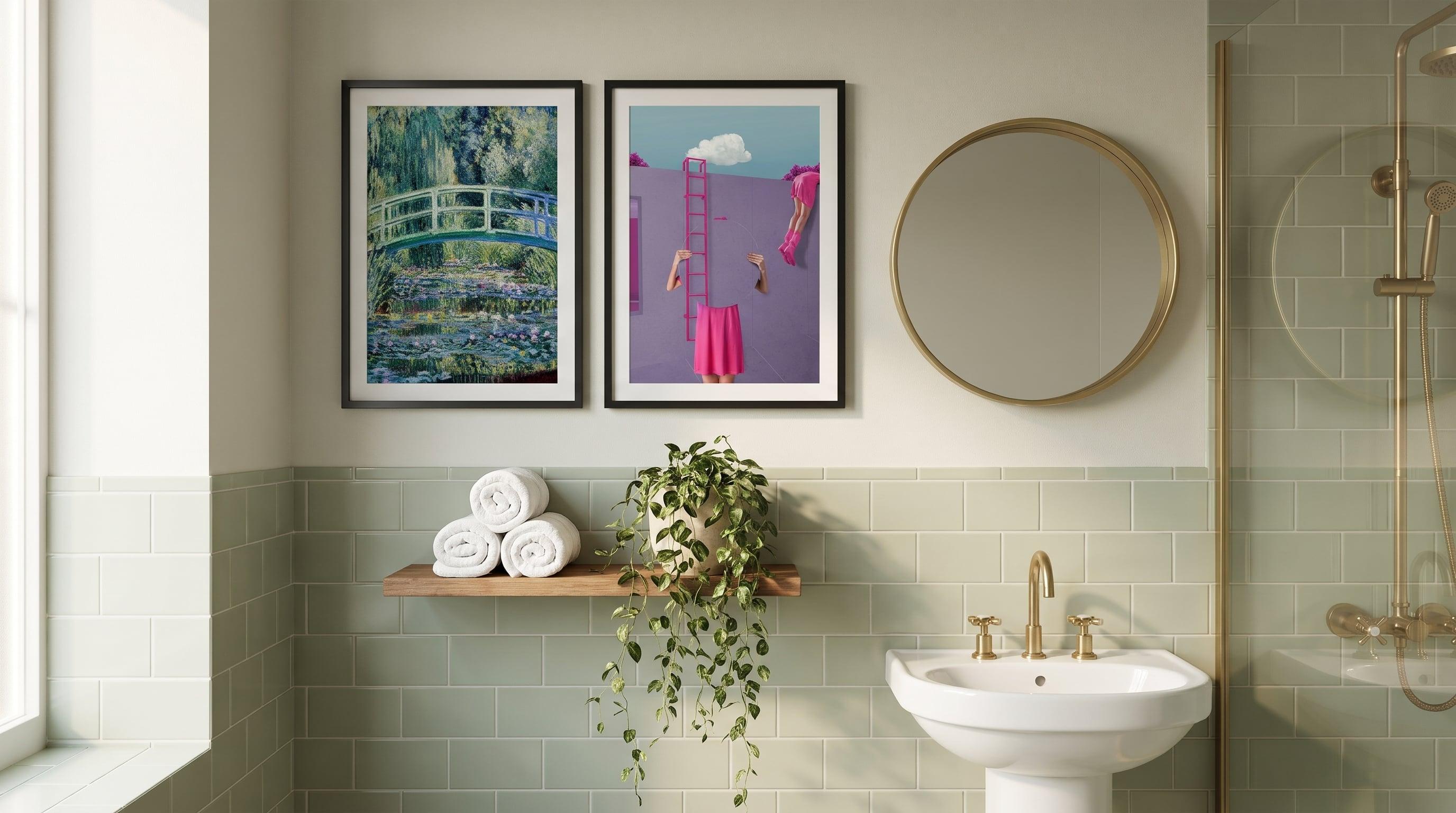
There's a particular logic to cramped rooms that rarely gets discussed: limited space forces clearer decisions. In a large bedroom, three posters can hang more or less however they like, balancing each other from a distance, existing without needing to justify themselves. The small bathroom offers no such generosity. Every square inch of wall is visible, every choice is immediately exposed – and that's exactly what makes the room interesting to work with.
Many assume that posters in a small bathroom call for compromise, that the space is too limited to be worth the effort. That's the wrong way to think about it. Constraint isn't an obstacle to composition – it is the composition. When you can't fill a wall with a whole visual language, you're forced instead to choose the single motif, or the pair, that can actually carry the room. The result is often stronger than the large gallery wall, precisely because there's nothing to hide behind.
How Limited Space Sharpens the Eye in a Small Bathroom
In a room of four or five square metres, there's rarely more than one wall that actually works for art – the rest is taken up by mirror, towel rail, door. The remaining wall therefore carries a different weight than the walls in the rest of the home. It has to hold your attention every time you walk in, and it has to do so without the help of furniture or plants to soften the impression.
This calls for a different kind of composition than the one you practise in the living room. Not collage, not groupings meant to be read as a whole from a distance, but a single motif – or at most two – that can withstand close contact. You stand near it. You look at these posters every morning, often at the same moment, in the same light. That motif has to bear repetition better than almost anything else in the home. For a broader look at how this plays out across the bathroom as a whole, see our wider guide to art in the bathroom.
A Single Motif Carrying the Room Alone
When one poster has to do the entire job, the choice of motif matters more than the choice of size or frame. What works best is rarely the most decorative option, but rather something with its own inner stillness or tension – a motif strong enough to hold the gaze without needing company. Calm water surfaces, deep greyscale tones, or a graphic, almost iconic composition handle solitude on the wall better than patterns built on repetition.
Think of the motif as a room within the room. A water mirror with water lilies creates calm without competing with tile and porcelain. A black-and-white, graphic take on a classic image almost functions architecturally – it frames the wall rather than decorating it. Since bathrooms are humid environments, it's also worth reading about how art prints are affected by moisture before settling on a motif and placement.


Scale – When a Small Room Calls for a Bold Move
The instinct in a small space is often to go small – a small poster on a small wall, as if the proportions should match each other. That's rarely the right call. A print that's too small gets lost among tile grout and light fixtures, while an image that fills its space, nearly spanning the wall's full width or height, creates focus instead of competing with every other surface in the room.
A large, textured or graphic motif in a small room acts almost as a counterweight: the less floor space there is, the more the wall needs to carry. A marbled abstract expression or a dark, almost sculptural composition can take up space in a way that feels natural rather than overbearing, precisely because nothing else in the room is competing for attention.


The Sightline from the Door
The most overlooked element in bathroom composition isn't the wall itself, but the path your eye takes to get there. What do you see first when you open the door? A mirror, a wall, a corner? Most small bathrooms have a clear sightline – the one you meet before you've even stepped fully into the room – and that's what determines where a poster does the most good, rather than wherever happens to be free wall space.
Here, the motif can afford a bit of humour or character, since it's encountered in quick, recurring moments rather than quiet contemplation. A playful animal composition with bathtub scenes catches the eye in passing in a way a quieter motif wouldn't – it rewards the brief glance.


When Two Is Enough
Sometimes more than one motif is still needed, but that doesn't mean the solution is a whole wall of frames. Two posters in conversation with each other – in form, in colour palette, in movement – can create exactly the rhythm a gallery wall would otherwise provide, just condensed into a pair of images. This requires that they genuinely speak to one another: the same visual register, but not identical expressions.
A round, circular composition next to an angular, geometric shape can, for instance, form a pair that feels deliberate rather than randomly thrown together. That's the difference between filling a wall and composing it – and in the small bathroom, there's rarely room for anything but the latter. For more ways to think about the whole, see our guide to posters in the bathroom.


Frequently asked questions
- How many posters work in a small bathroom?
- Often one or two is enough. With limited wall space, every addition becomes more visible, and a single strong motif carries the room better than several weaker ones combined.
- Should posters be small because the room is small?
- Not necessarily. A larger format that fills the wall's surface often creates more focus than a small one that risks getting lost among tiles and fixtures.
- Where should posters be placed for the best effect?
- Consider the sightline from the door – the wall or corner your eye meets first is often the most valuable spot, more important than wherever there happens to be free wall space.
- How do I choose between one motif or two?
- If the wall has a clear shape of its own, like a narrow strip between door and mirror, a single motif usually works best. On a wider, more even wall, two posters sharing a colour palette or visual language can create a nice rhythm.