
The Sea in Art – Water, Horizon and Light
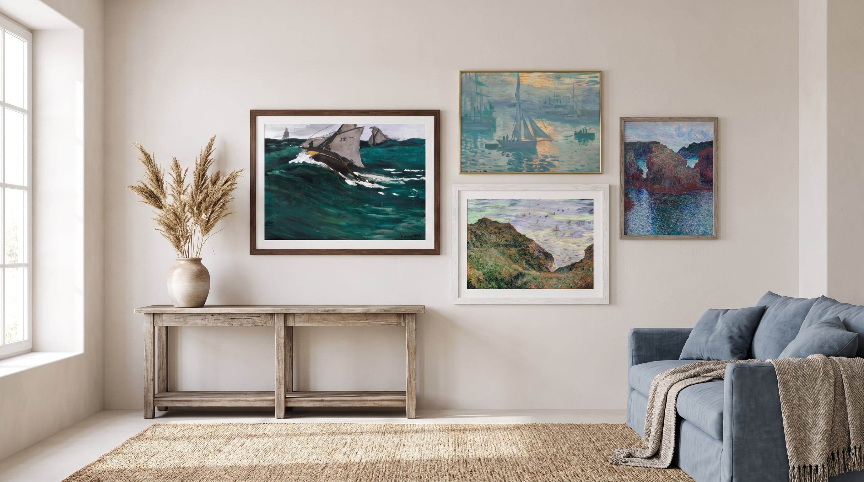
There's a reason the sea keeps returning, again and again, throughout the history of painting. No other natural form holds the same contradiction: always moving, always the same. For centuries, artists have stood on the same shoreline as their predecessors and still found something new to say – because the sea changes with the light, with the season, with whoever is watching it.
Hanging a sea motif on the wall is rarely about depicting a specific place. It's about letting something larger into the room – a reminder of horizons, of expanses that can't be possessed. From Hokusai's disciplined wave lines to Monet's dissolved patches of light and today's starkly abstracted coastal scenes: the sea has become one of the most enduring branches of landscape art, a way of exploring what an image can actually be.
Here's a look at how the sea has been painted, drawn and printed into what we now call sea posters – and why the motif continues to fascinate.
The Wave as an Icon in Art History
Few images have spread as effectively through art history as the great wave. Katsushika Hokusai's woodblock print from the early 1800s achieved something few artworks manage: it became a symbol that outlived its own context. The curved, almost claw-like crest with Mount Fuji in the background isn't just a depiction of nature – it's a composition so pure that it's still studied by graphic designers far beyond the art world.
What makes the wave motif so striking is the tension between chaos and order. The water is in the midst of collapsing, yet the linework holds everything together with a discipline that almost contradicts the motion. That paradox – controlled instability – may be why the wave as visual language never feels dated, whether printed in its original form or reimagined in a softer, more painterly palette.


Monet's Sea – Light in Constant Motion
Claude Monet returned to the sea time and again, from the cliffs of Normandy to the Mediterranean coast near Monaco. He rarely painted water as a fixed thing – rather as a surface where light bounces, breaks and dissolves. In his works, the horizon is often barely perceptible, a line that nearly vanishes into haze and reflection.
It's precisely that dissolution that makes Impressionist sea motifs feel so modern today. Monet was less interested in documenting a place than in capturing a fleeting state – a particular quality of sunlight, a certain humidity in the air, six o'clock on one specific morning. The result is less landscape and more mood, which explains why these works still feel surprisingly contemporary despite being painted over a century ago.


The Beach as the Boundary Between Sea and Land
Where the wave and the open sea are about vastness, the beach is something else entirely: a zone of encounter. It's the place where water and land negotiate, where tides retreat and leave their traces in the sand. Many contemporary sea posters gravitate here, to this border zone rather than the distant deep – a calmer, more horizontal world of imagery where sky, waterline and shore divide the picture into clear bands. This type of composition has much in common with how landscape art depicts nature as a whole.
But the beach is also movement and body. Surfing imagery and action motifs bring a different rhythm to the sea motif: the human figure measuring itself against the water, not merely observing it. It's a reminder that the sea in art has never been purely contemplative – it's as much about force as it is about calm.


The Sea Distilled – When the Motif Becomes Mood
Contemporary interpretations of the sea often move away from the figurative. Instead of an identifiable coastline or a specific wave, many artists treat water as a field of color and motion – broad, soft brushstrokes or sharply defined shades of blue, grey and sandy beige. It's a distillation that reminds us the sea's true expression is rarely about detail, but about light and scale.
This kind of abstraction works especially well in rooms where you want to retain a sense of nature without the image competing for attention. An abstract sea motif functions almost like a window rather than a painting – an opening onto something that lies beyond the wall.


Frequently asked questions
- What's a good sea motif to choose if I want something calm and undramatic?
- Look for images with straight horizon lines, a muted color palette and little movement in the water – abstract coastal scenes or still beaches tend to give that feeling, rather than large waves or active surfing.
- Do classic works like Hokusai and Monet suit a modern home?
- Yes. Both the wave motif and the Impressionist sea have a purity of composition and light that works well against simple, contemporary interiors – which is partly why they're still printed and hung so often.
- How do I choose between a figurative and an abstract sea motif?
- Consider whether you want to recognize the place or just the mood. Figurative motifs like beaches and waves tell a clearer story, while abstract interpretations leave more room for your own associations.