
Calming Art for the Bedroom – Prints That Slow Things Down
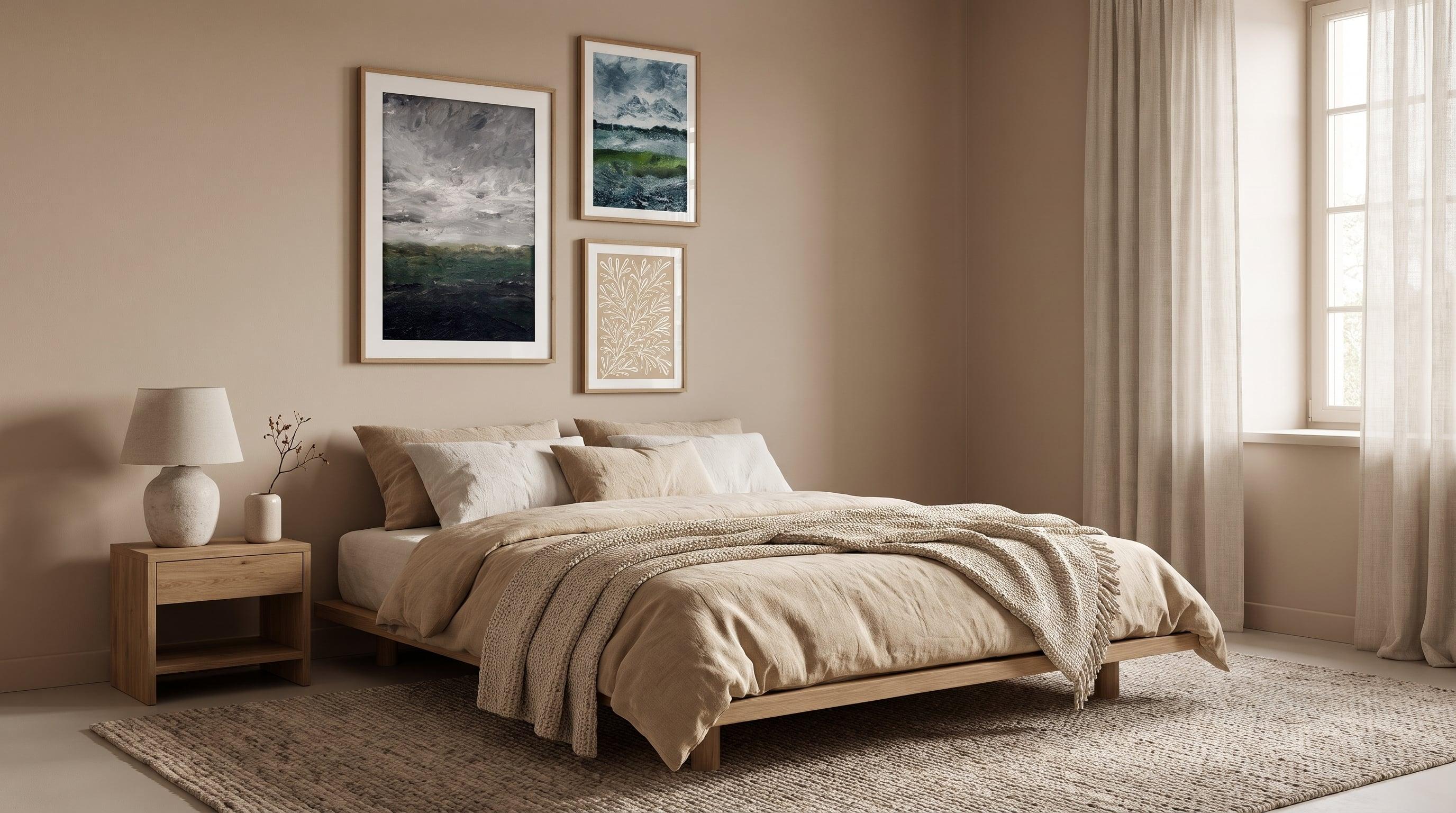
It's easy to assume that calming art is all about light, powdery tones – but that's only half the story. An image can be almost white and still feel restless, just as a dark, graphic composition can breathe stillness. What actually slows the pace in a bedroom comes down to something else entirely: how the lines move, where the eye lands, and how much contrast it has to process before it can rest.
If you're searching for calming posters for the bedroom, this is worth pausing on – we cover the bigger picture in our guide to the bedroom as an art space. A motif can be beautiful without being restful – and vice versa. Here, it's about looking past the colour palette and asking what the image actually asks the eye to do.
What Makes an Image Restful? Line, Contrast and Composition
The eye is always searching for pattern and movement in an image, and it's precisely that movement that determines whether a poster feels soothing or stimulating. Horizontal lines – a sea, a sky, a bank of fog – let the gaze glide in one unbroken motion. Diagonals and sharp verticals do the opposite: they create tension, even in the softest pastel shades.
Contrast plays the same role. An image packed with small, sharp details forces the brain to constantly scan and interpret, no matter how light the palette is. A muted, low-contrast motif – where shapes blend into one another rather than being sharply separated – gives the eye something to rest against instead. That's why a dense bouquet of flowers can feel more restless than a single, toned-down plant study, even though both are technically "botanical".
Negative space is the third factor. Breathing room around the subject, uncoloured areas, a composition that doesn't fill the entire frame – all of this signals calm in a way that colour alone never can.
Horizons and Tranquil Landscapes for the Bedroom
Landscape painting has long understood this. The haze of an impressionist morning light blurs out details that would otherwise demand attention, leaving only light, water and a suggestion of form. The same principle applies to abstracted landscapes, where the motif is reduced to a handful of tones and a soft horizon line – enough information for the eye to recognise a place, but not so much that it can't relax into it.
A calm sea works the same way: the water's surface repeats itself, the waves never break dramatically, and the gaze is allowed to move in a slow, predictable rhythm rather than jumping between sharp contrasts.


Botanical Motifs Without Visual Noise
Plant motifs are perhaps the bedroom's most popular choice, but not all botanical images are equally restful. A single branch, drawn in thin lines against a light background, leaves plenty of breathing room for the eye. A close-up of a dried flower, photographed in muted earth tones, builds its calm not through colour but by showing just one thing at a time.
Compare that to a dense pattern of leaves or flowers in full colour – the same subject matter, but a completely different visual load. It's the difference between a motif that breathes and one that fills every inch with information.


Abstraction That Breathes – Soft Shapes for Rest
Abstract art has a reputation for being dramatic, but soft, watercolour-based abstraction is something else entirely. Here there are no sharp outlines to decipher, no figures to identify – just colour flowing into colour, in shades of nude, beige and a calm blue-grey. The shapes are loose enough that they never demand a "correct answer" from the viewer.
It's an abstraction that doesn't ask for attention but instead gives the eye permission to wander freely across the surface without settling anywhere in particular – exactly the kind of visual pause a bedroom benefits from. Curious how size and height above the bed affect the experience? Read more in our guide to posters above the bed.


Texture That Whispers – Surfaces Instead of Subjects
Some of the most restful motifs contain barely any image at all – just structure. Crumpled paper, white surfaces with subtle shadows, fibre-like patterns in beige: these motifs work through tactile feeling rather than subject matter in the traditional sense. The eye reads them as surfaces to rest on, much like you'd regard a piece of fabric or a wall of raw silk.
It's an art form that works almost like background noise – present, but never intrusive – and it often pairs well with both landscapes and botanical elements in the same room without competing for attention.


Frequently asked questions
- Does calming art have to be in pastel colours?
- No. Colour matters less than composition and contrast. A darker image with calm lines and few details can feel just as restful as a light one.
- Can you mix abstract and botanical art in the bedroom?
- Yes, as long as the motifs share the same visual temperature – low contrast, a muted palette and a similar level of detail tend to work well together.
- Why do some light-coloured posters still feel restless?
- It's often down to composition rather than colour – dense patterns, sharp diagonals or lots of competing shapes can make even a pastel image visually demanding.
- Do landscape motifs work in small bedrooms?
- A landscape with an open horizon and plenty of breathing room can actually make a small room feel more spacious, rather than closing it in.