
Poster Above the Bed – Placement, Height and Size
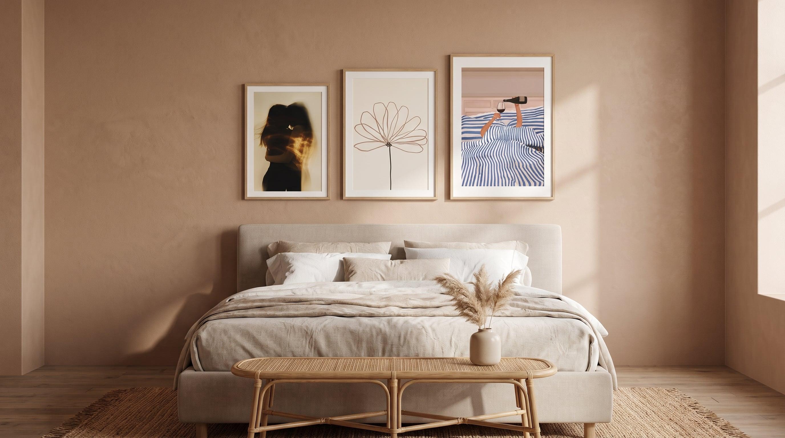
Most walls in a home are viewed standing up, from a distance, in passing. The wall above the bed is different. It meets you both when you walk into the room and when you linger ten minutes too long on a Sunday morning, head on the pillow, eyes angled upward. It's the same wall, but two entirely different ways of seeing it – and that actually changes what height and size feels right when choosing a poster above the bed.
Many people default to the same rules of thumb used for a sofa or a hallway: centre at eye level, width in proportion to the furniture below. But the bed is the only piece of furniture in the home we use lying down, and that makes the placement above it a slightly different problem. This article covers how to think about height, size and composition specifically for the wall behind the headboard – part of a broader discussion in our guide to the bedroom as an art space.
A lying-down view versus a standing view – two ways of seeing the same wall
Standing in the doorway, you see the wall above the bed much like you'd see any artwork – straight on, at a natural eye-level perspective. But lie down, and the angle changes radically. Your gaze travels upward and inward toward the wall, often from a foreshortened distance of just a metre or so. Details that read clearly from afar can feel different up close, and a composition that's balanced head-on can appear skewed when viewed from below and at an angle.
This isn't an argument for overanalysing every poster you hang. But it does explain why calm, open compositions often work better here than ones with a lot of detail at the edges – those edges are exactly what disappear from view when you're lying down.
What height feels right above the headboard
There's no fixed measurement that applies to every bed and every ceiling height, but a good starting point is to let the bottom edge of the poster sit a short distance above the headboard itself – roughly a hand's width to a forearm's length, rather than right up against it. Too little space and the image risks feeling cramped against the furniture; too much and the connection between bed and wall gets lost.
A simple way to test this is to sit up in bed and notice where your gaze naturally lands straight ahead. That point, rather than a universal measurement, is a better starting point for where to centre the poster in height.
The right size relative to the headboard
Just like with height, size is more a matter of eyeballing it than hitting exact proportions. A rule of thumb that tends to work well is letting the width of the image fill around two-thirds of the headboard's width – enough to read as a deliberate composition, but not so wide that it competes with the bed itself. A narrower bed may call for a narrower poster, or a portrait-oriented piece instead of a landscape one, to avoid feeling out of proportion.
Portrait formats generally suit the space above a bed particularly well, since they follow the line from headboard up toward the ceiling rather than spreading out sideways.


One large poster or a set above the bed
An alternative to the single large poster is a set – two or three images hung close together, ideally in a shared colour palette so they read as one whole rather than a collection of separate pieces. This works especially well above wider beds, where a single poster would otherwise need to be unusually large to fill the wall well.
Floral motifs are a natural example: a few pieces in warm or muted tones, hung at even intervals, create a calmer overall impression than one large statement piece – and they're easy to build on later if you want to add more. For a broader look at composing a bedroom's walls as a whole, see our guide to the bedroom as an art space.


Motifs that hold up over time by the bed
Since the poster above the bed is the last thing you see at night and the first thing in the morning, it's worth choosing something that won't wear on the eye. Soft, restrained colour palettes and open compositions – abstract lines, muted earth tones, a hint of form rather than a sharply defined motif – tend to serve this role better than something with high contrast or a lot of detail.
This doesn't mean everything has to be muted or subdued, but rather that the motif should hold up to being viewed again and again, in dim light, without demanding anything of you.


Frequently asked questions
- How high should a poster hang above the bed?
- There's no exact measurement that suits every room, but a good benchmark is to let the bottom edge sit a short distance above the headboard – not pressed right up against it, but not so high that the connection to the bed is lost. Try sitting up in bed and noticing where your gaze naturally lands.
- What size works best above a double bed?
- A common starting point is to let the poster fill around two-thirds of the headboard's width. Portrait formats tend to work especially well, since they follow the wall's height rather than spreading out sideways.
- Can you hang several posters above the bed?
- Absolutely – a set of two or three images in the same colour palette can work just as well as a single large poster, especially above wider beds where one image alone would otherwise need to be very large.
- Does it matter if the poster has a white border or not?
- Mostly a matter of taste. A borderless poster can feel more immediate and painterly, while one with a border gives a calmer, more framed impression – both work nicely above the bed depending on the feeling you're after.