
A Gift for the Art Lover – How to Choose the Right Print
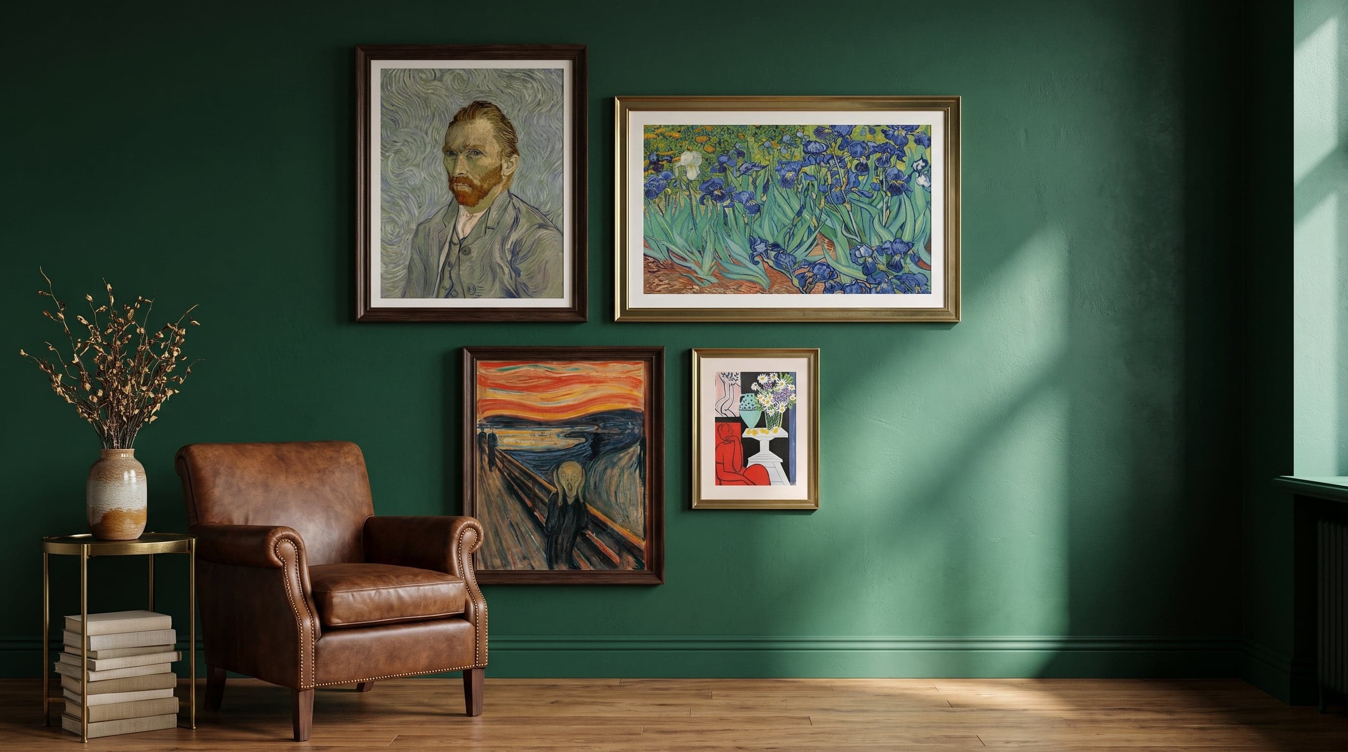
There's a particular kind of panic that sets in when you're buying art for someone who already knows their art history. The person who's been to Louisiana a dozen times, who can spot a Kandinsky from ten metres away, who already owns three books on Klimt. A too-obvious choice feels like a shrug – something they've seen on a thousand other walls. A too-obscure choice risks being incomprehensible, or worse: wrong.
A gift for the art lover is rarely about a lack of taste – most art enthusiasts have broad tastes and curiosity as their driving force. The challenge is finding the right version of what they already like – a work, a period, an expression that feels thoughtfully chosen rather than pulled from a top-ten list. Here's the path between the safe choice and the more surprising one, part of our broader guide to giving art as a gift.
For Someone Who Already Knows Their Art History
There are two classic missteps. The first is playing it too safe: a Mona Lisa reproduction, Klimt's embracing couple, the same motif found on every other fridge magnet in the museum shop. The image is right, but the sense of personal choice is entirely absent – it becomes a gift to art in general, not to the person.
The second misstep is the opposite: choosing something so conceptual or obscure that the gift requires a lecture to be appreciated. That's rarely what anyone wants on a Sunday evening when the package is opened.
The best position usually lies between these two poles – a choice that shows you've seen who the recipient is, rather than what an interest in art generally tends to mean.
The Safe Bet – Masters Who Never Disappoint
Giving a famous name isn't wrong in itself. What matters is which work, and which angle. A self-portrait instead of the most reproduced motif. A detail rather than the whole. The gaze in Van Gogh's self-portraits carries a different kind of intimacy than the sunflowers that adorn everything from mugs to tablecloths – it's the same artist, but a more personal expression.
The same logic applies to The Scream: the image is so famous it's almost stopped meaning anything specific, yet giving it anyway, in the right format and context, still works because the anxiety in the motif continues to feel relevant, no matter how many times you've seen it.
Da Vinci's female portrait Lady with an Ermine is another example of safe without being predictable – just as technically accomplished as the Mona Lisa, but without the same cultural overexposure.


The Middle Ground – Famous Names, Less Expected Works
An effective way to navigate between safe and surprising is to stay with a name the recipient already loves, but seek out a work they might not have encountered. Klimt's Adele Bloch-Bauer I carries the same golden ornamentation that made him a poster name, but lacks the overexposure that's befallen his most famous embracing couple.
Matisse painted his daughter Marguerite several times, and this particular portrait showcases Fauvism's playful colour planes without being the motif people first think of when they hear his name. Monet's late water lilies, painted as his eyesight was already failing, have a different texture and weight than the more famous garden paintings from earlier years – a way of giving Monet without giving the Monet cliché.


Daring to Surprise – Abstraction as the Next Step
Someone well-versed in art history often has a solid relationship with the Renaissance, Impressionism and Modernism – but the early years of abstraction are less well-trodden ground, even for those who've visited most museums. Kandinsky's improvisations were built on the idea that colour and form could carry emotion as directly as music – a notion that still feels radical when seen in person.
Paul Klee's miniature worlds move in a different direction – playful geometry, almost childlike in its construction, yet carrying a philosophical weight that grew out of his time at the Bauhaus. Giving such a work to someone who mostly knows the great names of classical painting can be exactly the kind of surprise that makes a gift stand out, without feeling like a shot in the dark.


Context Is What Matters – Room, Format and Quality
A print doesn't exist in isolation – it has to get along with everything else in a home. Consider what the recipient already has on their walls: plenty of portraits already might suggest a landscape, while a wall dominated by dark tones might benefit from something lighter. Format matters too; portrait, landscape and square motifs work differently depending on which wall the gift is intended for.
For someone with a trained eye, the quality of the print itself is also noticeable. A twelve-colour giclée print on thick, matte art paper looks and feels different from cheap photo paper – a detail that might not be mentioned out loud, but that an experienced viewer notices immediately.
Context matters regardless of the occasion. A housewarming gift for a new home has different needs than an art print as a wedding gift, and someone giving a graduation gift to someone who's just moved out on their own is often looking for a different expression than someone giving to a person who's already built their own collection.
Frequently asked questions
- Is it better to choose a famous artist or a more unfamiliar expression as a gift?
- It depends on how well you know the recipient. The better your relationship, the more room you have to surprise them. If you're unsure, a lesser-known image by a big name is often the safest route – recognisable without being predictable.
- How do I avoid giving something the recipient already has or has seen too much of?
- Avoid the most reproduced motifs – the Mona Lisa in its entirety, Klimt's embracing couple – and instead look for a specific work, a detail, or a lesser-known period from the same artist.
- Does it matter whether the print has a white border or not?
- It's mostly a matter of taste that affects how the motif reads on the wall. A border gives a more airy, gallery-like impression, while edge-to-edge lets the motif claim the entire surface. Sizes range from 21x30 up to 70x100 centimetres.
- Why does print quality matter for this kind of gift?
- Anyone used to art often notices the difference in materials. Twelve-colour giclée prints on FSC-certified art paper with a matte finish produce deeper colours and a surface that doesn't glare, making details in the original work more visible.