
Neutral Posters for the Office – A Workspace Without Noise
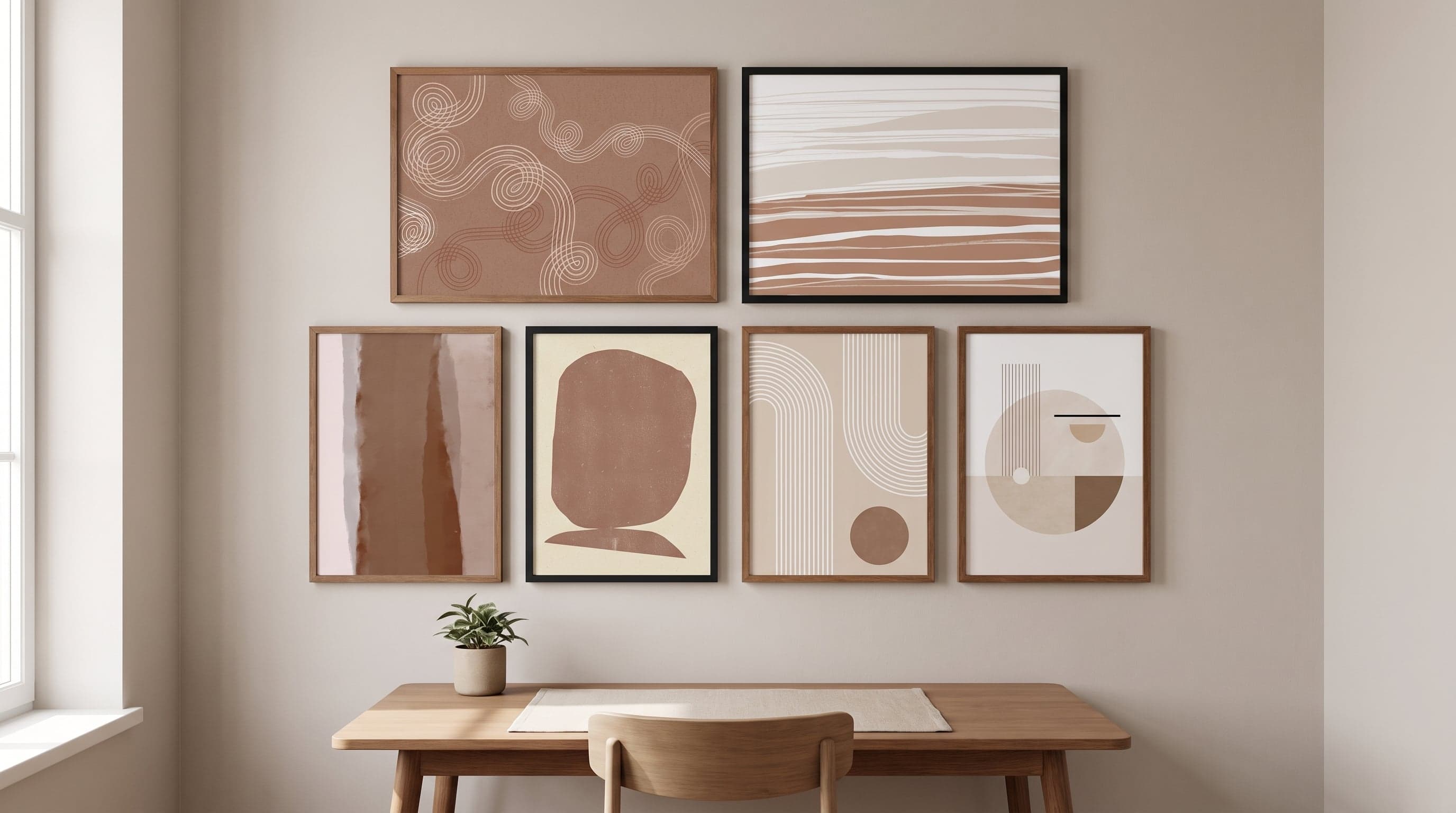
There's a particular kind of tiredness that only sets in after a day spent in front of a screen in a room full of visual competitors – a bold graphic poster here, a patterned fabric there, a wall painted in too strong a shade. The body stays still, but the eyes have been working overtime. Perhaps that's why so many people decorating their home offices are now making a conscious shift away from the colourful and towards something more subdued.
Neutral posters for the office are rarely about making a room look expensive or minimalist for its own sake. It's about creating a visual register that doesn't compete for attention with the actual work at hand. Sandy surfaces, soft greys and shapes without sharp edges give the eye something to rest on between tasks – rather than something to decode.
It's a shift worth understanding, not just following.
Why the Eye Tires From Too Much to Look At
Concentration is a limited resource, and it depletes faster in environments where the eye constantly finds new details to process. An office with strong contrasts, saturated colours or complex patterns gives the brain more to filter out – even if we don't consciously notice it. Over a full working day, this becomes a cumulative strain.
This isn't the same as saying colour is wrong or that everything must be white. Rather, it's about contrast in moderate doses: when the wall itself is calm, a single expressive piece can find its place without the room feeling overloaded. A quiet backdrop makes it possible to actually notice what deserves attention – a conversation, a screen, a thought that needs to be followed through to the end.
Many people working from home have also discovered that the line between home and workspace blurs faster than expected. A room that's visually amped up all the time makes it harder to truly unwind in it, whether the clock reads nine or nineteen.
Sandy and Earthy Tones as a Foundation
Sand, clay, suede, pale stone – the names of today's popular shades say something about where the aesthetic is heading. These are tones drawn from nature rather than a paint chart, colours already present in wood, linen and untreated stone. They carry a built-in restraint that makes them hard to grow tired of.
In a workspace, these shades function as a kind of base chord. They rarely clash with furniture, desks or storage, and they age without feeling dated the way bolder trends often do. A poster in soft terracotta or a print in broken white works less as a standalone eye-catcher and more as an extension of the room's light.


Shapes That Settle Rather Than Shout
The abstract visual language that works best in a focused environment is rarely dramatic. Soft arcs, incomplete circles, lines that stop just short of forming a pattern – motifs that suggest rather than explain. They give the eye something to follow without demanding a response.
This is different from emptiness. A wall with no art at all can feel just as unfocused as a wall with too much on it, only in the opposite direction. The point is balance: an expression that is present but not insistent, more like quiet company than a loud message.


Composing Without Creating a New Focal Point
Anyone wanting to hang more than one poster in their workspace quickly runs into a pitfall: every addition risks becoming its own focal point if it doesn't relate to the others. The solution is rarely more colours but rather a shared register – the same family of tones, a similar density in the shapes, a sense of calm that holds the whole together even when the motifs differ.
Think of the wall as a single composition rather than several separate choices. Two or three prints in related shades, hung with breathing room between them, create an impression of considered stillness rather than a collection of mismatched tastes. Those looking for a clearer statement on the wall instead might find their expression in motivational posters for the office – a completely different register, but with the same underlying idea that every choice on the wall should be deliberate.


Frequently asked questions
- Does an entirely neutral office feel impersonal?
- Not necessarily. Neutral tones are a backdrop, not a void – personality can come through in the choice of motifs, composition and placement on the wall, rather than through bold colours.
- Do sand-toned posters suit all types of workspaces?
- They work especially well in rooms with natural light and simple materials like wood and linen, but also in more formal office settings where you want to avoid a sterile, overly corporate look.
- How many posters should you hang on an office wall to avoid visual clutter?
- There's no exact rule, but a grouping of two to three motifs in related tones tends to create more calm than either a single large statement piece or a densely packed gallery wall.