
Abstract Art for Focus – Posters That Quiet the Mind
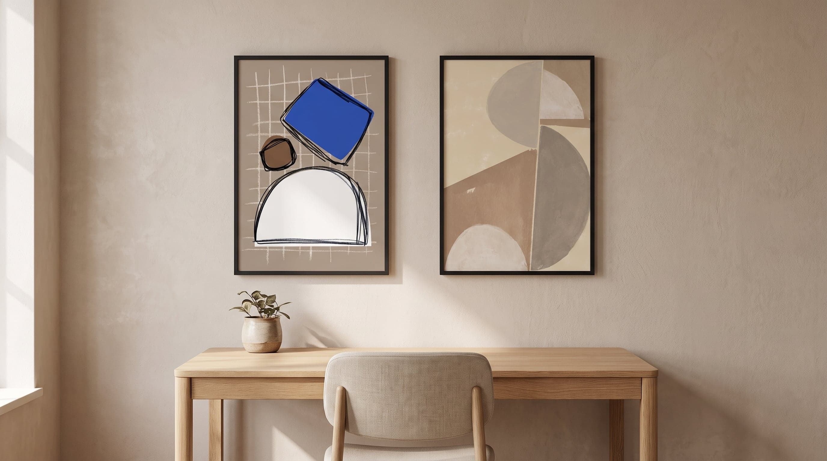
After a few hours in front of a screen, the eyes start looking for somewhere else to land. Not necessarily something to look at in the literal sense – more a surface with no job to do. This is where a lot of figurative art falls a little short in an office setting: a portrait wants to be seen, a cityscape wants to be decoded. The abstract asks for nothing of the kind.
Shapes without a clear subject, soft transitions between tones, compositions that don't tell a story – these are qualities that make a piece hard to sum up in a single glance. And that's exactly why you never quite finish looking at it. The eye can rest there for a moment, drift on, and come back again without needing to interpret anything new.
If you're weighing up posters for the home office, or simply want your office wall to do something other than fill space, it's worth pausing on this point: abstract posters for the office rarely compete for attention – and are often exactly the ones that deserve a place in your field of view.
The eyes need a different kind of stimulation
Screen work is, at its core, a narrow kind of focus – text, icons, flickering tabs, all compressed into a few inches directly ahead. The eyes benefit from occasionally seeking out something with a completely different rhythm: larger surfaces, calmer lines, nothing to read. Abstract art offers exactly that. There's no 'correct' way to read a composition of shaped fields or flowing boundaries, which lets the brain switch off from its usual decoding work.
This is quite different from how we usually choose art. Many people look for a subject they recognise or simply like – a landscape, a face, a place. In an office, where the eyes meet the same wall day after day, that logic can be flipped. Unlike, say, motivational posters with a clear message, abstract art never asks for a reaction – and it's often the pieces that say nothing in particular that hold up best over time.
Shapes with no agenda – geometric abstract posters for the office
Some abstract works deal almost exclusively in geometry – circles, incomplete squares, fields that meet along soft edges rather than sharp lines. They tell you nothing about a place or a moment. They simply exist, balanced within themselves, and it's exactly that quality of self-containment that makes them restful to look at over long stretches of work.
What several of these compositions share is a restraint in both form and colour. Nothing loud, nothing asking for a reaction. More a kind of visual quiet that acts as a counterweight to everything else competing for attention during a workday.


A palette drawn from earth and stone
Much of the art that works best in work environments sits within an earthy range – sand, clay, terracotta, greyish brown. Colours that don't compete with the blue-white glow of a screen but rather balance it out. It's no coincidence this palette keeps turning up in so much contemporary interior design; it signals calm without tipping into sterility.
In a work setting, where so much else is already glossy and digital, this kind of colour scale adds something material. Not through subject matter, but through tone – a reminder that there are textures and shades beyond the screen's interface.


Movement that goes nowhere in particular
Another direction within the abstract is the fluid – soft, organic lines that move without pointing toward any particular destination. Unlike geometry's fixed forms, these compositions are about transitions: one shade slowly becoming another, an outline that never quite closes.
That kind of movement is calming rather than stimulating. The eye can follow a line without needing to understand where it's heading, which gives the mind a similar kind of room to wander. For anyone switching between intense bursts of work and shorter breaks, this can be exactly the sort of visual breathing space needed between tasks.


Choosing size and placement for concentration
Placement matters at least as much as the subject itself. A poster directly in your line of sight, facing the screen, should be restrained rather than detailed – otherwise it risks becoming just one more thing to process. If the piece sits in your peripheral vision instead, slightly to the side or behind you, it can afford to be more genuinely expressive, since the eye only wanders past it now and then.
Size follows the same logic: a smaller format near the desk creates a close, almost tactile encounter with the surface, while a larger format on an open wall spreads its calm across the whole room. Since everything is printed using giclée technique on a matte, FSC-certified fine art paper, the surface doesn't reflect sharp light – worth keeping in mind in rooms where screens are already glowing.
Frequently asked questions
- Why does abstract art work better than figurative imagery in an office?
- A figurative subject often asks to be interpreted – a face, a place, a story. Abstract art carries no such demand, so the eye can rest there without the brain needing to decode anything. That's especially valuable in environments where you're already processing a lot of information, like in front of a screen.
- What size works best in front of a desk?
- It depends on distance and wall space, but small to medium formats tend to work well close to the workspace, since they create an intimate encounter without dominating your field of view. Larger formats suit a wall you view from a bit further away.
- Does colour choice matter for concentration?
- Restrained, earthy or gently cool tones tend to feel calming over time, while strong contrasts and bold colours are more likely to draw attention. That said, which palette works best varies from person to person.
- Do the posters glare under screen light?
- No. Everything is printed on matte fine art paper, which doesn't reflect light the way glossy paper does, making the posters comfortable to have in view even in rooms with a lot of screen glow.