
Art Movements – A Guide to Understanding What You Hang on the Wall
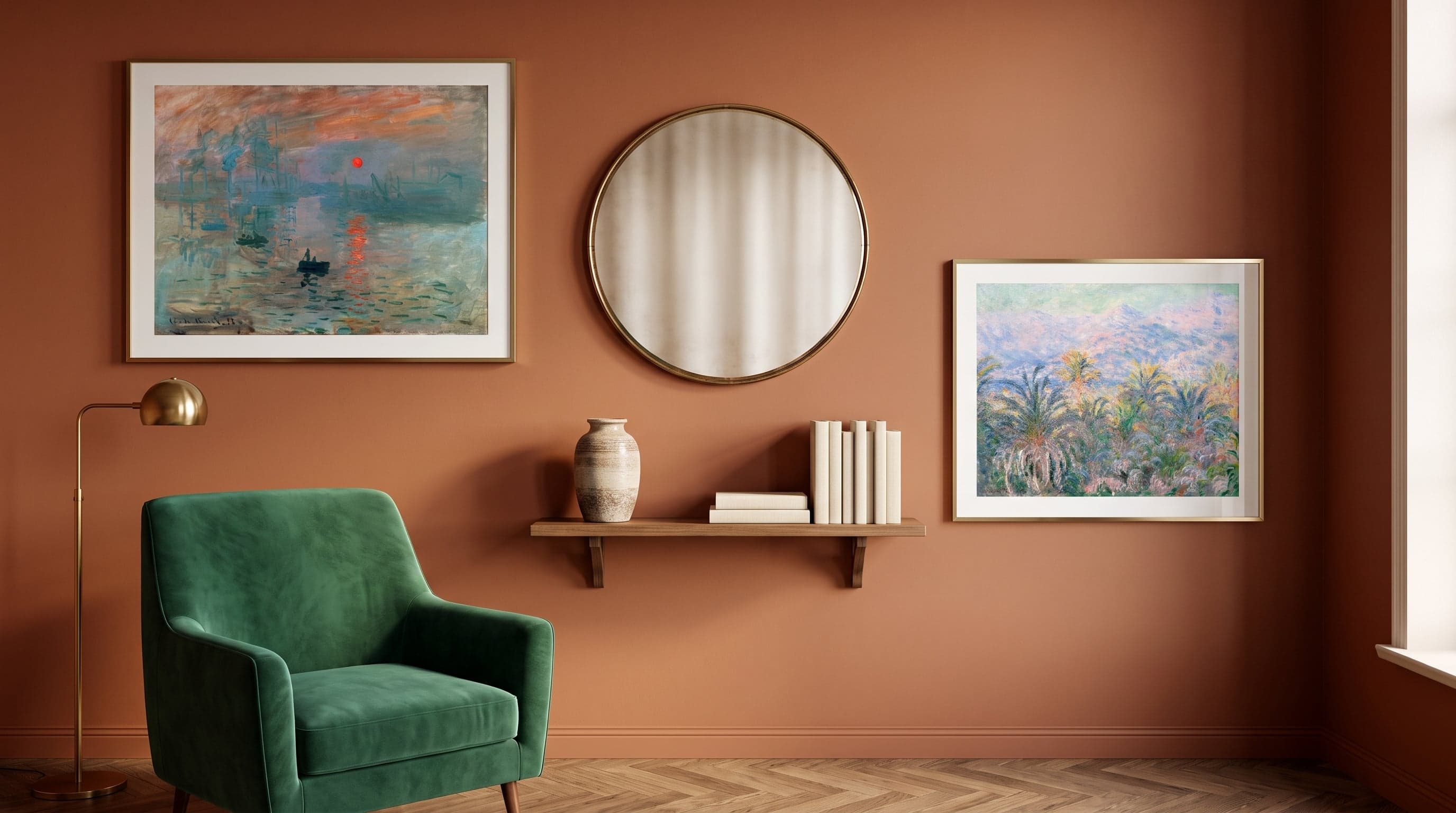
There's a moment in front of a painting when something feels familiar without you quite knowing why. A certain way of laying down colour, a certain tautness in the line, a calm or unease in the composition that registers in the body before the mind can name it. It's rarely chance. More often, it's history speaking – layer upon layer of decisions artists have made over centuries about light, about form, about what images are actually meant to do.
We surround ourselves with these decisions every day without always connecting them to their context. A grid of lines in a kitchen might echo Bauhaus. A flower painted in loose dabs carries the Impressionist way of seeing light as movement rather than fact. Being able to name these movements isn't about becoming an art historian. It's about understanding your own eye a little better – why certain images feel peaceful and others unsettled, why some walls carry colour effortlessly while others call for stillness.
This guide moves through some of the art movements that still shape how we choose art for the home: from the quiet precision of the Renaissance to the free forms of abstraction. Not an exhaustive chronology, but a map of the visual languages that continue to influence what we put up on our walls.
The quiet precision of the Renaissance
What strikes you first about Renaissance painting is the control. Light never falls by accident, the gaze is never directed without intention. Leonardo da Vinci worked with a technique called sfumato – Italian for "smoke" – where outlines dissolve into soft transitions rather than hard lines. The result is portraits that seem to breathe, faces that hold a secret just beneath the surface.
It's this quality that makes Renaissance portraits so enduring even in a modern home. They ask nothing of the room around them. A composed profile, a still hand resting on an animal or flower, a face turned toward a light whose source we never see – these are images built to hold the gaze for a long time, not capture it quickly. In an age of fast image consumption, that slowness becomes almost its own kind of statement.


The light and moments of Impressionism
The name Impressionism was born almost as an insult – critics claimed the paintings were mere sketches, impressions rather than finished works. But that was exactly the point. Claude Monet and his contemporaries no longer wanted to paint what they knew was there, but what they actually saw: light changing minute by minute, water that is never the same surface twice.
Brushstrokes became visible, colour applied in short, broken dabs that blend in the eye rather than on the palette. Subjects moved out of the studio and into the garden, the harbour, the rolling field. This is an art best experienced at a distance – and on a wall, it creates a room that breathes rather than narrates. Water lilies, palm trees backlit by the sun, a harbour at dawn: Impressionism turned the fleeting moment into its own visual language, one that still lives on in how we keep searching for light and movement in what we hang up.


From brushstroke to scream – when feeling took over
Where the Impressionists wanted to capture light, the next generation wanted to capture something harder: the inner state. Vincent van Gogh painted skies that swirl and sunflowers so saturated with yellow they seem to vibrate – colour is no longer a description of reality but an expression of how it feels. The brushstroke becomes a register of mood, thick, fast, almost sculptural.
Edvard Munch's The Scream takes this all the way. The lines curve like sound waves, colour bleeds across contours, a face dissolves in its own anguish. This is the core idea of Expressionism: that form may distort if it makes the feeling truer. It's also why these images never become decorative in the strict sense – they demand something of the viewer, a kind of solidarity rather than mere approval.


The colour explosion of Fauvism
The Fauves – "the wild beasts", as one critic dubbed them, half in mockery – took colour a step further than anyone before them. Henri Matisse painted faces in green and blue without concern for what the eye "should" see, letting pure, unbroken fields of colour carry the entire composition. Shadow doesn't have to be grey. A tree doesn't have to be green. Colour was allowed to become its own argument.
There's a streak of pure joy in this painting style, a playfulness in how figures dance and burst into motion without worrying about anatomical accuracy. Forms are simplified into large, flat planes – almost an early echo of graphic design. That's what makes Fauvism surprisingly easy to live with today: it speaks the same language as much of contemporary, colour-driven, form-conscious illustration.


Art Nouveau and the decorative rebellion of the line
Around the turn of the 20th century, art turned back to nature, but in a new way. Art Nouveau – or Jugend, as the style is known in the Nordics – drew its forms from the winding stems of plants, the wings of birds, the movement of water. The line was left to carry the entire composition, often combined with flat fields of colour and a pronounced feel for pattern over depth.
Gustav Klimt's shimmering gold surfaces and Toulouse-Lautrec's posters for Parisian nightlife share the same basic idea, despite looking completely different: the image as decoration, as pattern, as a visual language drawn as much from graphic arts and craft as from classical painting. That's why this era feels so modern despite its age – it anticipated how poster art and design would come to reconsider the image as ornament.


The abstract revolution – Bauhaus and the formless
At the start of the 20th century, a group of artists asked themselves a radical question: does art have to depict anything at all? Wassily Kandinsky believed that colour and form could carry meaning just as music does – without representing a single recognisable subject. His Improvisation series is exactly that, improvisations in colour, built on feeling rather than description.
The Bauhaus school took a different path toward the same freedom: geometry as a universal language, the circle and the square as building blocks for a visual order beyond the personal brushstroke. It's an aesthetic that still defines much of today's design, from typefaces to furniture. Hanging geometric abstraction next to an early 20th-century work by Kandinsky is to see two answers to the same question: what remains of an image once representation is stripped away?


Frequently asked questions
- What exactly is meant by an art movement?
- An art movement is a period during which artists, often independently of one another, begin to share a similar way of seeing and depicting the world – a certain relationship to colour, form, or subject matter. Movements often blend into one another rather than starting and ending on a fixed date.
- Do you need to know art history to choose the right poster?
- No. But recognising a few basic traits – an expressive brushstroke, a decorative line, a geometric surface – can help you understand why certain images appeal to you more than others, and make it easier to trust that instinct.
- Can you mix different art movements on the same wall?
- Absolutely, and it's often done with great results. What ties a gallery wall together is rarely the origin of the style but rather colour temperature, line character, and contrast – a clean geometric poster can sit beautifully alongside a softer, expressive piece if the palette speaks the same language.
- Which movement suits a more restrained, minimalist interior?
- Geometric abstraction and Bauhaus-inspired expressions tend to work well in pared-back spaces thanks to their distilled visual vocabulary, but Renaissance portraits with their quiet stillness can create a similar sense of calm through their controlled composition.