
Retro in the Kitchen – Where Nostalgia Meets Function
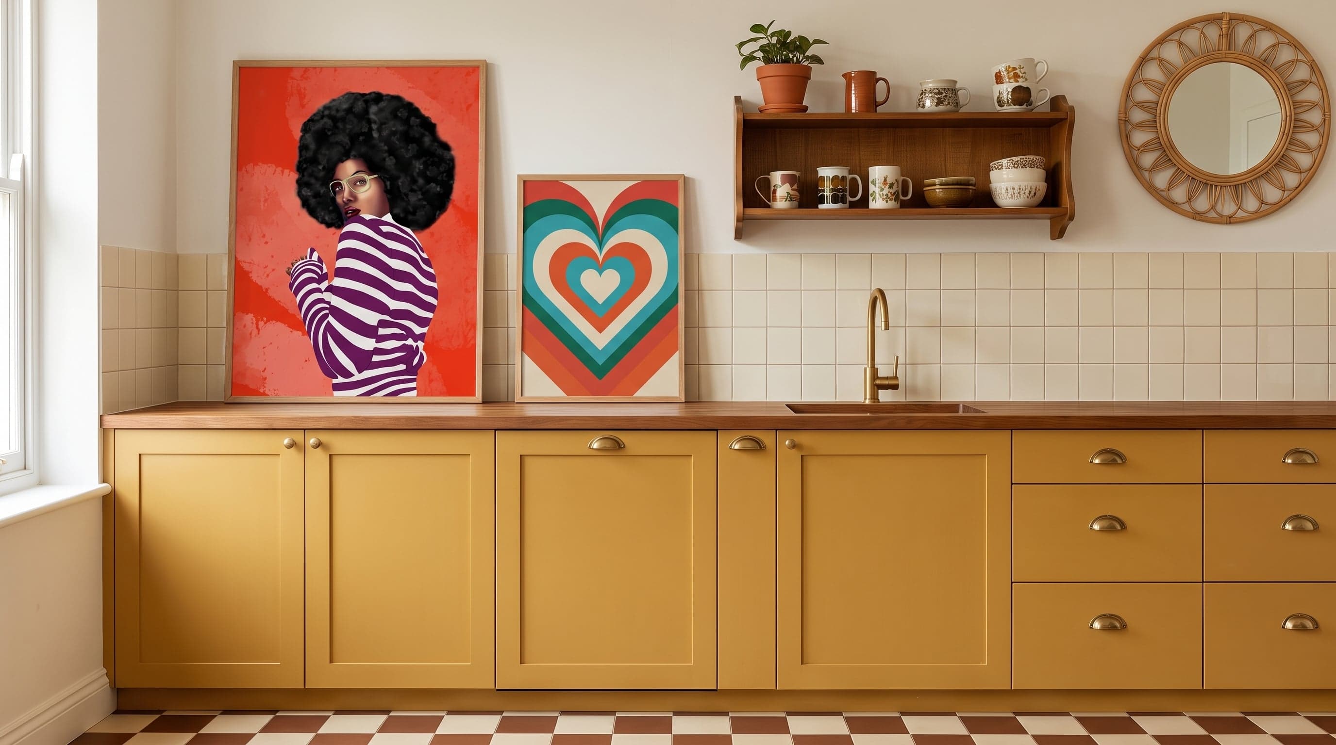
The kitchen has become the most democratic art space in the home – a notion close to the heart of how we think about posters for the kitchen in general. This is rarely where you hang your most expensive or most formal piece – it's where you hang what you genuinely enjoy looking at while the coffee brews. Perhaps that's why retro aesthetics feel so at home here: they carry a playfulness that never quite made it into the good living room.
Advertising art's bold outlines, disco's glittering circles, the saturated colour fields of the 70s – these motifs have travelled through decades without losing their edge. On the wall, they don't look like museum pieces. They look like something you've just pulled out, fresh and a little cheeky.
What makes retro kitchen posters more than a nostalgia trip is that the visual language genuinely works: clean lines, restrained palettes, a sense of graphic discipline that holds its own even in a room full of crockery and kitchen tools.
The Golden Age of Advertising Moves into the Kitchen
Before advertising became photographic, it was illustrated – and often considerably more fun for it. 1950s ad graphics were built on crisp outlines, flat colour areas, and a seemingly naive optimism that worked just as well on a herring tin as on a film poster. This is the feeling many of today's kitchen prints borrow: promising, a touch exaggerated, always with a wink.
In a kitchen, that style works like a visual joke without a punchline – you get the tone instantly, without needing to read the text. A print featuring a fishing motif, or a quote styled like an old gossip column, does exactly that: it smiles right back at you.


70s Colour Play in the Kitchen, Seen with Fresh Eyes
The seventies are often described as a decade of liberated lines and bold colour choices, though that image is a simplification – shaped as much by hindsight as by the era's own archives. What can be said is that the graphic design of the period had a genuine appetite for experimentation: concentric patterns, wide stripes, warm earth tones mixed with sharp contrasts.
That aesthetic has seen a resurgence in interiors seeking to move away from strict minimalism. In the kitchen – a room full of straight lines and cool surfaces – a pattern-rich print becomes a way to introduce movement without compromising function. The colour does the work that would otherwise require more objects.


The Disco Ball as Still Life on the Kitchen Wall
If the fifties were advertising's decade, the late seventies belonged to disco – an era where glamour and everyday life collided on the dance floor. That aesthetic, with its metallic surfaces and concentrated points of light, has found an unexpected home among pots and kitchen utensils. Perhaps because the kitchen, much like the dance floor, is a stage for togetherness rather than stillness.
A print featuring the reflections of a disco ball, or a typographic ode to money and glamour, adds a theatrical touch without demanding any grand gesture elsewhere. It's decor that whispers rather than shouts, despite the high volume of its motifs.


Food as the Main Character on the Kitchen Wall
Before food photography became its own craft, ingredients were illustrated by hand – tomatoes, salami, chilli peppers drawn with the same care a portrait painter gives a face. That tradition lives on in posters that make food the subject itself, rather than the backdrop to something else, a theme we explore further in food and drink as art motifs.
The difference from an ordinary cookbook spread lies in the stylisation: colours are heightened, shapes simplified, composition deliberately graphic. The result feels neither like advertising nor nostalgia, but something of its own – a kind of portrait of appetite, hung exactly where appetite lives.


When Several Decades Share the Same Kitchen Wall
What makes retro style sustainable rather than merely nostalgic is precisely that it rarely belongs to a single year. A wall can carry the illustrative playfulness of the fifties alongside the pattern intensity of the seventies without feeling disjointed – a principle that applies especially to posters above the kitchen table, where several styles often meet in the most social corner of the kitchen.
This is also where the difference between pastiche and reference becomes clear. A motif that quotes its era without blindly imitating it ages with dignity. It's this balance that allows a print from a bygone age to hang in a newly built kitchen and still feel right at home – not as a time capsule, but as one choice among many possible ones.
Frequently asked questions
- Do retro posters suit a modern, minimalist kitchen?
- Often better than you'd think – a graphic, colourful motif can work as a counterpoint to clean surfaces and neutral materials. The key is to let a single poster be the room's one loud detail.
- How do I mix several retro styles without it looking messy?
- Try starting from a common denominator, such as a colour temperature or a type of line work, rather than a specific decade. That way, different eras can play off each other instead of competing.
- Do retro kitchen posters date quickly?
- Motifs built on strong graphic language and thoughtful composition tend to last longer than you'd expect – it's usually surface-level trend details, not graphic quality, that age fast.