
Food and Drink as Subject Matter – The Art of Hanging Your Appetite on the Wall
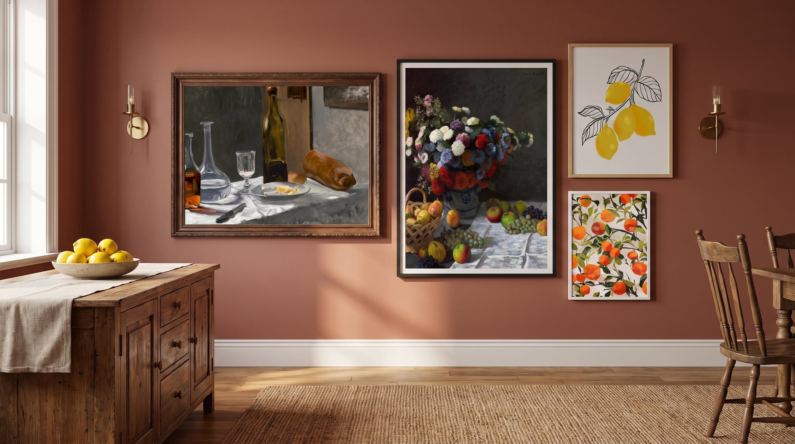
There's something quietly refreshing about painting what you've just eaten. A half-drunk glass of wine, a peeled orange, crumbs on a linen cloth – details so ordinary they rarely get a second glance, yet in art history they've carried heavier meaning than most portraits. Still life is art's way of pausing before the fleeting.
As early as the 1600s, Dutch painters made food the leading character. Tables laden with oysters, lemons and silver jugs were rendered with a level of detail that almost defied reason – not to glorify abundance, but often as a reminder of its opposite. That same curiosity lives on today, just in different forms: graphic cocktail illustrations, watercolour citrus fruits, minimalist coffee cups. Food and drink as subject matter has never gone out of style – it's simply changed brushstrokes.
Food and drink posters have become a natural way to bring this artistic tradition home – not least in the kitchen, where theme and room meet.
The Long Meal of Still Life – From Vanitas to Everyday Motifs
The word still life – from the Dutch stilleven, roughly "still life" or "quiet existence" – named a genre that truly took shape during the Dutch Golden Age of the 1600s. Painters didn't work from a model in the traditional sense but staged their subjects like theatre: fruit stacked in pyramids, glasses positioned so light refracted through the wine, a broken loaf hinting at a meal just finished.
Behind the beauty often lay a moral layer. Rotting fruit, extinguished candles and hourglasses – so-called vanitas motifs – reminded the viewer that everything earthly, even the richest feast, is temporary. But it's easy to forget the symbolism and simply enjoy the technique: how a glass of water is painted to truly look wet, how a lemon peel curls in a single, unbroken brushstroke.
Monet's Table – The Quiet Meals of Impressionism
Two centuries later, the Impressionists took still life out of the studio, though never entirely away from the table. Claude Monet, best known for his water lilies and outdoor light studies, also painted laid tables and flower arrangements – subjects where the same interest in light and colour vibration took hold, just on a smaller scale. In his hands, bread, carafe and wine bottle no longer symbolise impermanence, but become excuses to study how daylight falls across a surface.
It's a shift worth noting: from the strict symbolism of the 1600s to the pure painterly joy of the 1800s. The subject remains the same – a set table – but the gaze has changed.


Fruit as Form and Colour Study in Contemporary Art
Fruit has always been a rewarding subject, perhaps because it combines everything an artist wants to practise: round forms, delicate transparency, a colour range spanning from tart yellow to deep burgundy. In contemporary interpretations of fruit as art, the symbolism is rarely as loaded as in Baroque vanitas paintings – here it's more often about pure composition. An orange segment becomes a study in circular form, a strawberry layer an exercise in shades of red against a light background.
The lightness of watercolour has become a recurring way of expressing exactly this: the fruit isn't painted photorealistically but suggested, with fluid borders between peel and shadow. It gives the motifs a scentless freshness – almost as if you could still pick them up.


The Glass as Subject – Wine and Cocktails in Graphic Interpretation
If fruit represents the soft side of still life, the glass is its sharper counterpart. The wine bottle and cocktail glass have become genres of their own within contemporary graphic illustration – often distilled down to a few shapes and colours, far from Dutch detail but sharing the same fascination with light passing through liquid. A wine poster doesn't need to depict a bottle at all; sometimes a single shadow of red is enough for the motif to be recognised.
It's an aesthetic that borrows as much from advertising posters as from art history – clear outlines, flat colour fields, a sense of the moment rather than quiet reflection. Such a poster often works beautifully as art above the kitchen table, suiting both everyday life and celebration. Yet it carries forward the same basic idea found in 17th-century paintings: that a drink, properly observed, says something about togetherness and celebration.


The Coffee Cup – Everyday Life's Own Still Life
Where wine signals celebration, the coffee cup has become the symbol of its opposite – the first calm of morning, a pause in the middle of the day. As a subject, it's surprisingly young in art-historical terms, but has quickly become one of the most recurring themes in contemporary food and drink posters. Perhaps because it captures something instantly recognisable without needing explanation: the table, the cup, the rising steam.
In illustrations featuring coffee, you often see the same tension between realism and simplification found in other still-life traditions – a cup can be rendered almost photographically detailed, or reduced to a handful of lines and a coffee stain. Both approaches work, because the subject carries its own atmosphere regardless of style.


Frequently asked questions
- Why is still life with food and drink such a recurring subject in art history?
- Food and drink offer artists a rewarding subject for studying light, form and colour, while historically also carrying symbolic messages about impermanence, abundance and togetherness.
- Do posters with wine and cocktail motifs suit the kitchen?
- Yes, such motifs often work well in kitchens and dining areas since they tie into the same theme the room already embodies – food, drink and gathering around the table.
- How are your food and fruit motif posters printed?
- All posters are printed using 12-colour giclée on FSC-certified Fine Art paper, giving fine colour reproduction and a smooth, matte surface without glare.