
Green Posters – Nature's Colour Indoors
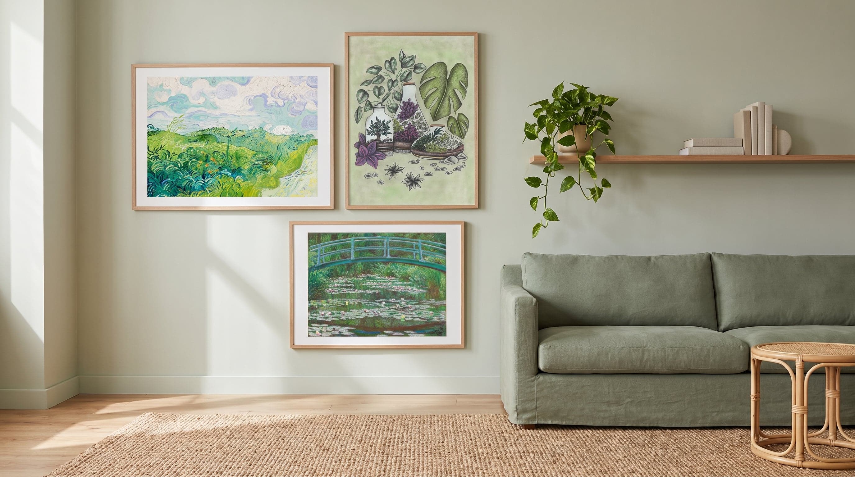
Green is rarely a neutral colour. It carries weather, season, light – an apple green differs from a mossy green as much as an April day differs from an October evening. Perhaps that's why green appears so persistently throughout art history, from botanical illustrations meant to catalogue nature to the Impressionists' attempts to capture light falling through leaves.
In recent years, interest in green at home has been revived, partly as a reaction against the sterile and digital – green posters have become an obvious way to bring that feeling onto the wall. But talking only of plants and biophilia misses something: green on a wall is also an artistic choice, with its own history of techniques, pigments, and ways of looking at nature. This piece moves between the two – between art history and living room.
The Green Light of Impressionism
Few have painted green as sensitively as the Impressionists. Monet's water lily ponds and Van Gogh's wheat fields are rarely about green as a single colour – rather, they're hundreds of shades placed side by side, broken up by yellow sunlight or cool shadow. The technique, with short, visible brushstrokes, meant the colour never went flat. Viewers had to blend the impression themselves from a distance, which is part of why these works still feel alive rather than historical.
This is also why green motifs from this period work so well as posters today. They aren't decoratively green in the sense of being uniform – they vibrate with variation, which means they rarely grow tiresome on a wall where the light changes throughout the day.


The Precision of Botanical Green
Alongside painting's loose brushwork exists an entirely different tradition of green: the scientific illustration. Here it's about exactness rather than mood – every leaf, every vein, every seed drawn so it can be identified. The botanical image was born from a need to catalogue nature, but the result was often as much art as science.
In contemporary interpretations of this visual language, precision meets a freer, more illustrative expression – dense compositions of leaves and branches that borrow their structure from herbariums but their feeling from something more inviting. This is green that doesn't try to be a window onto nature, but rather a study of it.


The Green Legacy of Pattern
No one has shaped our idea of decorative green more than William Morris. His patterns, drawn during the British Arts and Crafts movement as a protest against industrial mass production, were built on careful studies of vegetation – acanthus, vines, foliage folding in on itself. Green in Morris's work is never just background; it's the very structure the pattern rests on.
This legacy lives on in today's interest in maximalist, pattern-dense surfaces. A wall filled with green repeated in rhythm creates a different kind of spatiality than a single green surface – denser, more textile, almost wallpaper-like even when it's a single art print.


Green Beyond the Nature Motif
Not all green is about foliage. The colour turns up in unexpected contexts – in ancient ceramics, in abstract compositions, in forest motifs broken down into form and surface rather than recognisable detail. It's a reminder that green works as artistic expression even without a literal connection to botany.
An olive green against a deeper, almost black-green creates a completely different mood than the light, yellow-green tones the Impressionists preferred. Here it's about weight and concentration rather than light and movement – a green that draws the eye inward instead of spreading it out.


Composing with Green
Green is unusually forgiving as a wall colour because it already exists in so many registers – from cool and blue-green to warm and yellow-green. This makes it possible to combine several green works on the same wall without monotony, as long as the shades are balanced against each other rather than repeated identically. If you want to place green in a broader context, there's a fuller overview in our guide to posters by colour.
- Let a deeper green meet a lighter one for contrast in tone, not just in motif.
- Feel free to mix eras and techniques – an Impressionist water lily motif next to a spare botanical line drawing creates tension rather than a clash of styles.
- Remember that green changes dramatically depending on light. What looks muted at dusk can turn almost neon in midday sun.
The matte surface of fine art paper makes a real difference here – a glossy print would compete with the light rather than working with it, which is especially noticeable in the deeper green tones. If you want to soften the impression, green pairs well with the calmer tones of beige posters, while those seeking sharper contrast can lean on black and white posters as a counterweight.
Frequently asked questions
- Do green posters work in every type of room?
- Yes, though the result varies depending on light conditions. In rooms with plenty of daylight, light green, Impressionist tones come into their own, while deeper green shades often work better in rooms with warm or dim light, such as bedrooms and dining rooms.
- Can you combine several green posters on the same wall?
- Absolutely – green is a colour with great range, and several shades together often create more depth than a single expression. Aim for variation in tone and motif rather than repeating the same green.
- Do green posters pair well with real green plants in the room?
- Often, yes. A botanical illustration or a forest motif can enhance a leafy shelf rather than compete with it, especially if the poster's shade differs slightly from the plant's to avoid everything blending together.