
Black and White Posters – The Simple Power of Contrast
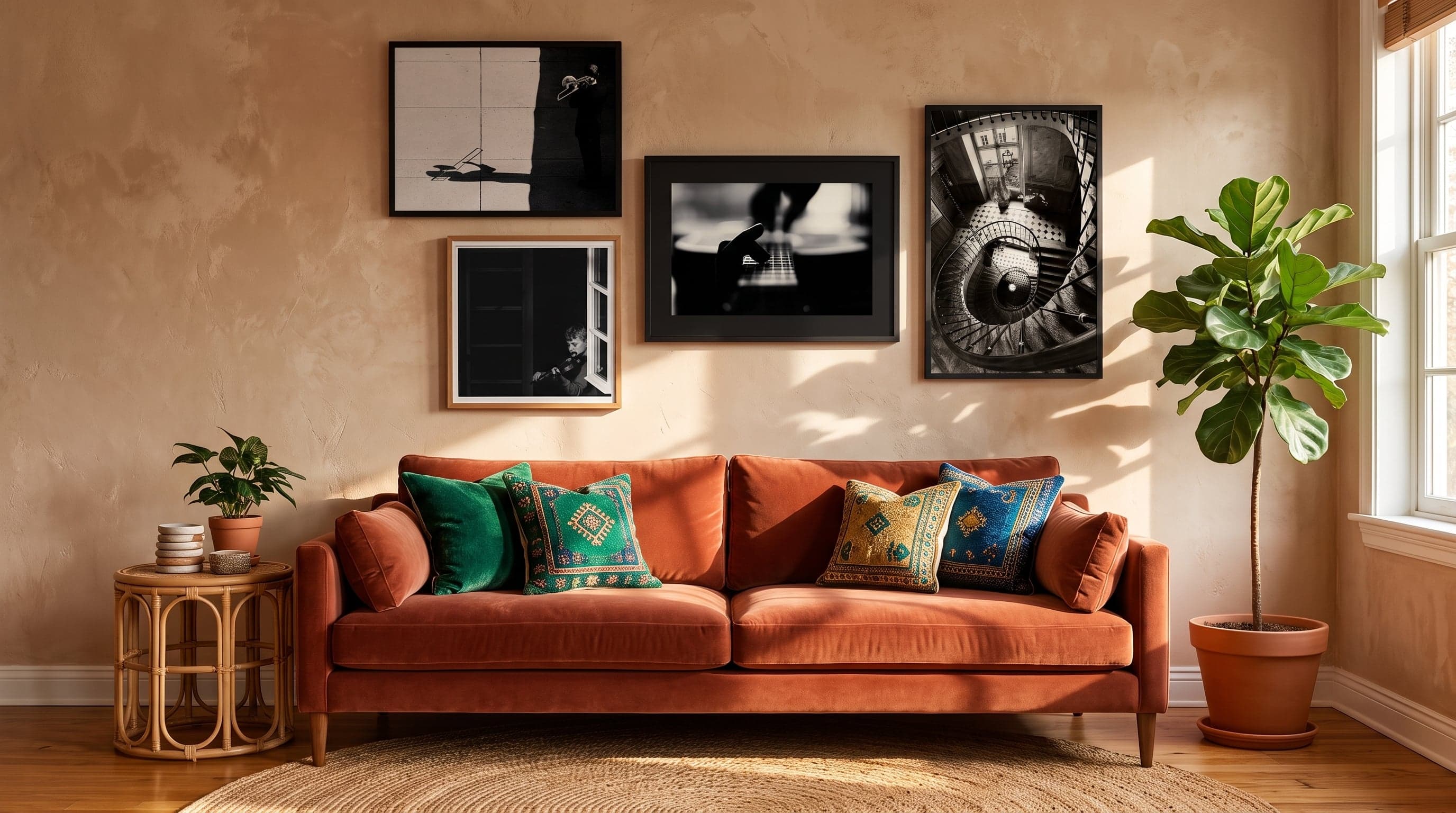
There's something about the absence of colour that makes an image feel more urgent. Strip away the tones and what remains is simply form, light and shadow – the three elements that actually carry a picture. Perhaps that's why black and white has never really left us, not in photography, not in drawing, not in the history of graphic design. It's a visual language already distilled to its essentials.
On the wall, black and white posters rarely play the lead role. Instead, they act as the framework everything else rests on – a quiet counterpoint in rooms where colour already dominates, or a natural whole in their own right when several motifs are brought together. If you want to dig deeper into how different shades interact in a room, read more about how colour choices affect the mood of a space. What all black and white motifs share is contrast: that sharp boundary between black and white that makes the eye linger a little longer than it otherwise would.
The Black and White Tradition in Photography Through History
Photography was black and white long before it became an aesthetic choice. But even once colour caught up with the technology, many photographers chose to strip it away again – so the image could be about the fall of light, not the distraction of hue. A street musician backlit against the sun, a violinist behind a windowpane, a blurred self-portrait where the outlines dissolve: everything becomes more concentrated without the noise of colour.
It's a tradition that borrows as much from documentary photography as from classical portraiture, and it still feels relevant today – perhaps precisely because it never tried to be trendy.


Architecture and Cityscapes Drawn in Ink
Line drawing is black and white in its purest form – no in-between, just the thickness of the stroke and the white left as air. Cityscapes rendered this way carry a different feeling than photography does: more subjective, more deliberate. The artist has already decided which lines matter and which can dissolve back into the paper.
Canal houses in Copenhagen, façades in Paris, street corners that feel familiar even if you've never been there – this is architecture told through gesture rather than documentation, and it's exactly that distinction which makes graphic black and white cityscape prints so easy to live with over time.


Art History's Icons Reimagined in Black and White
Some works are so vividly colourful in our collective memory that seeing them in black and white feels almost contradictory. Munch's The Scream, for example – one of art history's most quoted expressions of anguish – takes on a different character once recast in greyscale. Less expressionism, more graphic scream-symbol. Colour, it turns out, was never really the point; it was the line, the composition, the twisted mouth.
The same holds true for Klimt's The Kiss, or simpler motifs like two intertwined hands: once the colour disappears, the gesture remains, pure and legible, as if the work had been distilled down to its core.


Character and Humour in Black and White Motifs
Black and white doesn't have to be solemn. A cat portrait in high-contrast greyscale, or a dalmatian drawn with crisp, defined spots, often carries more personality than its colourful counterpart – the gaze, the pattern of the fur, and the subtle ironic undertone that humour so often requires all become sharper when nothing else competes for attention.
It's a reminder that black and white isn't only about gravity and architecture. It works just as well for the playful – arguably even better, since the contrast makes gestures and expressions read instantly.


Black and White Posters as a Neutral Base in a Colourful Home
In a room already filled with colour – a green armchair, terracotta textiles, a yellow door – black and white posters rarely compete. Instead, they act as breathing space, areas where the eye can rest between all the shades. It's the same principle at work in editorial design: black and white as a frame around colour, not its opposite. If you'd like to explore that interplay further, our guide on posters by colour and how shades affect a room has more to offer.
Bring together several black and white motifs in different styles – photography, line drawing, a classic artwork – and the result is often a surprisingly cohesive whole, even when the pieces come from entirely different eras and techniques. That's the logic of contrast at work: as long as black meets white, the composition holds together.
Frequently asked questions
- Do black and white posters work in a home with lots of colour?
- Yes, often especially well there. Black and white rarely competes with bold colours – instead, it acts as a neutral pause for the eye, a surface with no colour temperature to reckon with.
- Is black and white art more timeless than colourful art?
- It's hard to say as a general rule, but the absence of colour trends means black and white motifs rarely feel dated the way strong colour choices sometimes do over time.
- Do black and white motifs from different techniques work together on the same wall?
- Often surprisingly well. Photography, line drawing, and classic artworks in black and white all share the same underlying contrast, which means a combined wall composition still feels unified.