
Botanical Prints for the Kitchen – Where the Greenery Keeps Growing Up the Wall
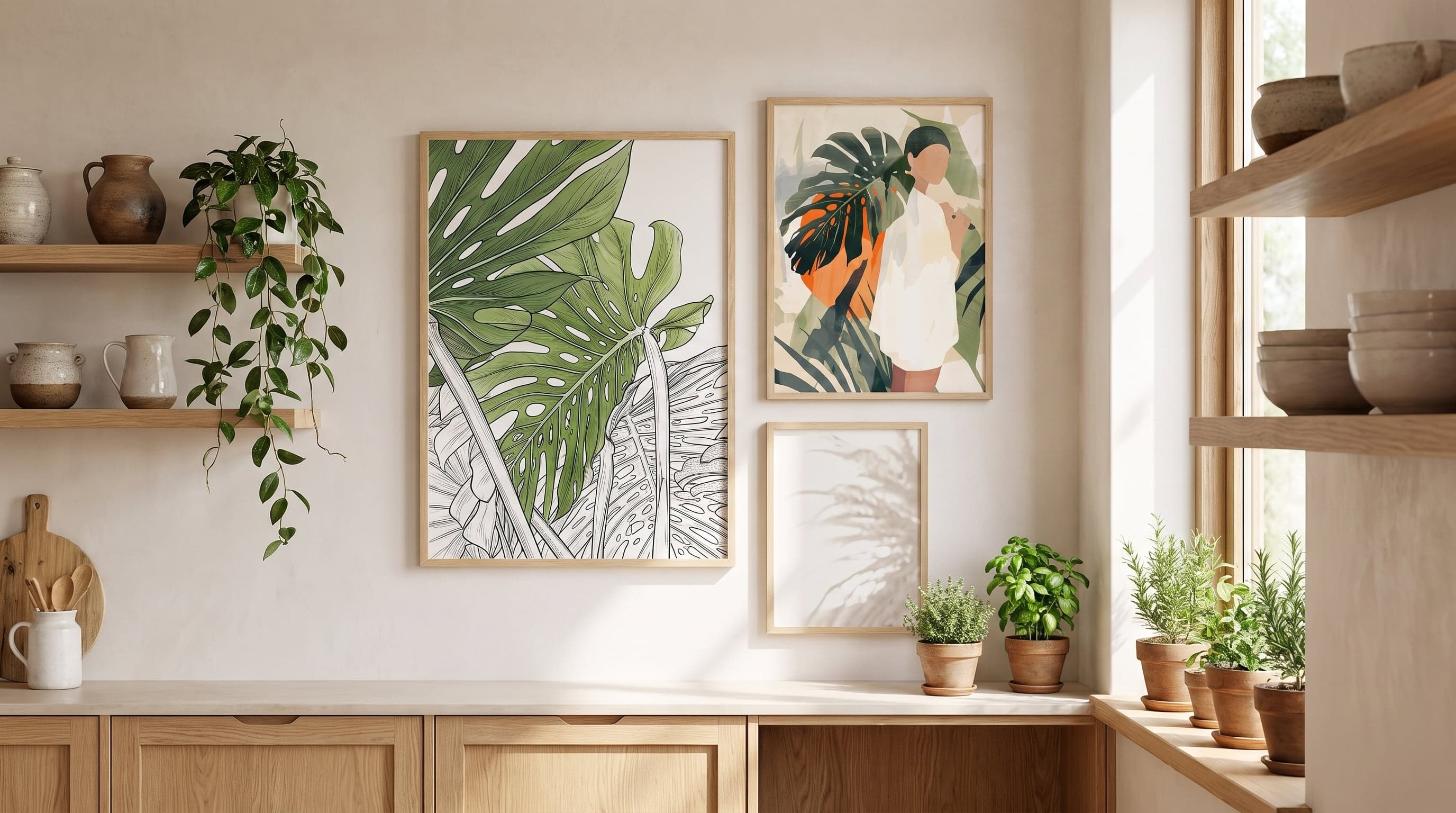
The kitchen window is often the most alive surface in the house. Pots crowd together here, morning light filters through leaves turning toward the glass, and a quiet, ongoing plant project unfolds by the sink. It's rarely a coincidence that the kitchen becomes the room where most houseplants gather – the light is right, the humidity is right, and it's where your eyes keep landing throughout the day anyway.
Botanical prints take that logic one step further. Instead of the greenery stopping at the windowsill, it continues onto the wall, at a different pace and a different scale. Foliage that never wilts, a branch frozen mid-motion. Botanical motifs in the kitchen are less about decorating and more about extending a conversation that's already happening between the room and whatever is growing in it.
It's hardly by chance that this particular room suits leaf motifs and line drawings so well. Natural light does something to botanical images that artificial lighting rarely manages – it makes them breathe. You'll find the same idea explored further in our guide to posters for the kitchen, where light and room shape determine the right motif.
Light Does the Work in Botanical Prints
A kitchen window rarely gives constant light. It shifts through the day, casting sharp shadows in the morning and softening by the afternoon. Botanical motifs – especially those with simple shapes and clear outlines – respond to that movement in a way more detailed images don't. A line drawing of foliage looks different at eight in the morning than at four in the afternoon, depending on where the sun sits.
That's also why a matte, untreated surface works better here than a glossy one. Fine Art paper without shine doesn't bounce light straight back into your eyes, which is otherwise a common problem in rooms where a window faces the wall you've chosen to hang something on. Instead, the light is absorbed, and the motif stays readable no matter where in the room you're standing while cooking.
The combination of daylight and botanical motif creates a kind of optical continuation – the eye travels from the real plant on the windowsill to the drawn one on the wall without quite registering the switch.
Leaf Shape and Line in Botanical Prints
Line drawings of plants work especially well in kitchens for a simple, formal reason: they rely on contrast and negative space rather than detail. A thin sprig against a white background reads just as easily in harsh morning light as in the softer glow at midday. Where a photographic image can turn flat or overexposed in strong light, the line drawing gains from it.
The acanthus leaf is one example of a motif with a long history in decorative design – its wavy, symmetrical shape has recurred in ornamentation long before it found its way into botanical prints. The winding lines of a grapevine and the clear leaf shape of an oak belong to the same family: motifs simple enough to work as pattern yet still clearly drawn from nature.
In a kitchen, where surfaces are rarely completely still, that restraint becomes an advantage. The line drawing doesn't compete with pots, spice jars, and everything else already taking up space on the counter.


Jungle Greenery for Sunny Windows
In kitchens where the sun sits high and stays long, saturated, dense leaf motifs work in a way they rarely do in shadier rooms. Deep green, broad leaves, and a composition that almost spills over the edges – these are motifs that need light to avoid feeling heavy, but under the right conditions they create the same effect as a real monstera in the corner: the room feels fuller, more alive, as if something is actually growing there.
Palm leaves and jungle motifs also benefit from the play of shadows created when midday sunlight filters through blinds or curtains. The shapes are never entirely static – they shift along with the room around them.


Muted Tones for Nordic Kitchens
Not every kitchen wants a jungle feel. In bright, understated kitchens – white tile, light wood, sparse decor – a muted palette works better: brown, grey, a hint of green rather than a loud one. Here it's less about the leaf mimicking a real plant and more about the motif yielding to the room's brightness.
This type of botanical kitchen motif also tends to age well visually – it doesn't compete with each season's interior trends but settles into the background, ready to become part of the wall rather than a temporary addition.


Fruit Near the Kitchen Table
Leaf motifs don't have to stop at leaves. Citrus on the branch, oranges heavy with their own colour, flowers that have just opened – these motifs move in the space between botany and what you actually eat, which makes them especially at home in a kitchen. They connect not only to the greenery on the windowsill but also to what actually ends up on the cutting board.
At a kitchen table or on the wall beside the dining area, this type of motif works as a soft transition – less strict botanical illustration, more still life. The colour can afford to be a touch deeper here, since the motif is often viewed up close. If you want to move from plant motifs to the food itself, it's worth looking closer at how food and drink as motifs work on the wall, or considering which print suits the space above the kitchen table itself.


Frequently asked questions
- What size works best next to a kitchen window?
- It depends on the wall space around the window, but smaller and medium formats (21x30 to 40x50 cm) often work best where space is limited by cabinets or a window frame. Larger formats suit a free wall a bit further from the window.
- Do posters fade from hanging near a window?
- Good-quality Fine Art paper is made to age well, but direct, prolonged sun exposure is rarely good for any kind of print. Try to place the motif so it gets ambient light in the room without being hit by direct sunlight for most of the day.
- Do botanical motifs work in kitchens without much daylight?
- Yes, but the effect changes. In darker kitchens, simpler line drawings and lighter backgrounds tend to work better than dense, saturated motifs, since the contrast stays clearer even in dimmer lighting.
- Can you mix several leaf motifs on the same wall?
- Absolutely – as long as they share a common tone, such as the same colour range or similar line weight. It's often easier to unify a wall with several botanical motifs than to combine completely different themes.