
Blue Posters – Calm on the Wall
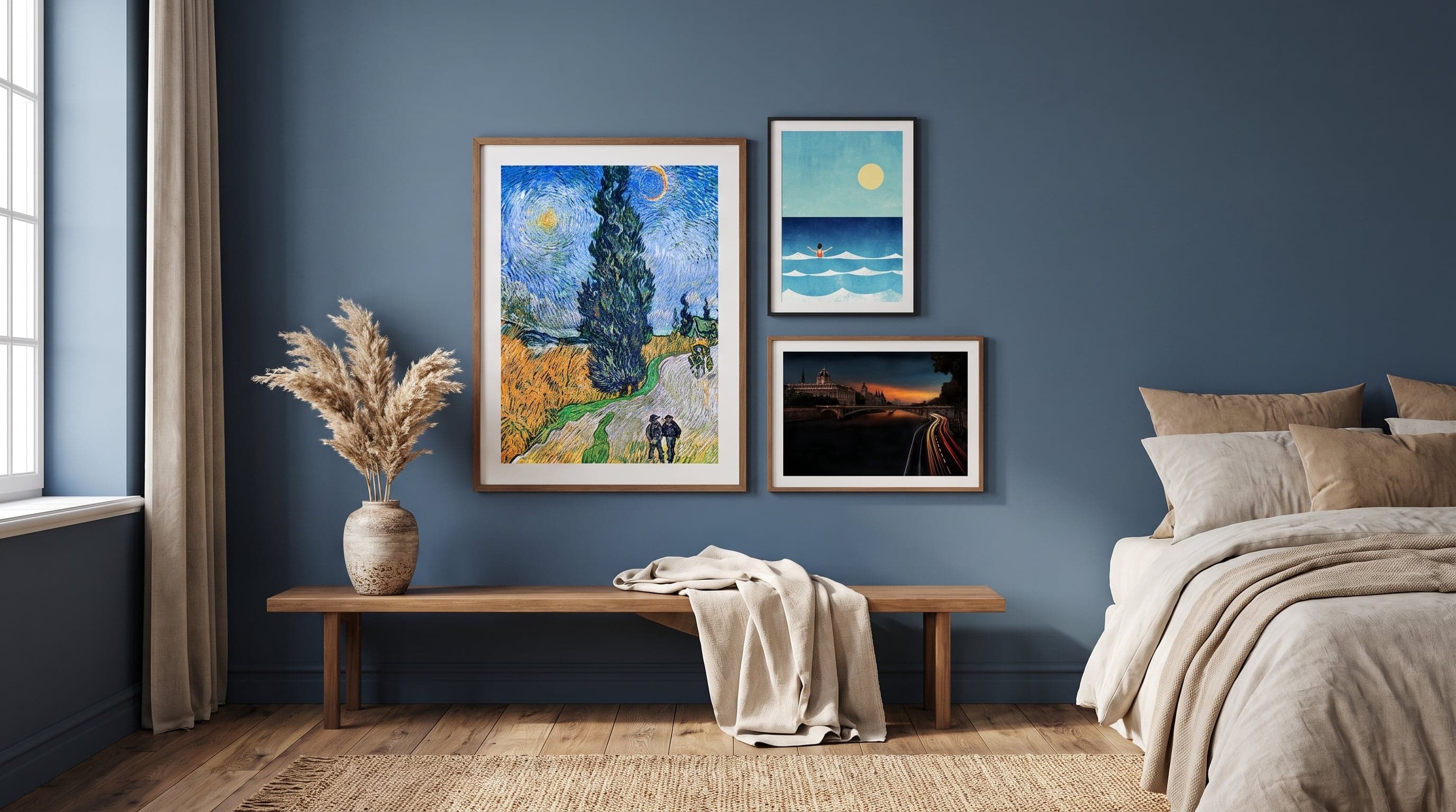
No colour has demanded more from artists than blue. During the Renaissance it was ground from crushed lapis lazuli, imported from mines in what is now Afghanistan, and the price meant blue was often reserved for the holiest elements of a painting – the Virgin's mantle, the edge of the heavens. To paint in blue was to paint something precious, almost literally.
That history still shapes how we read the colour today. Blue rarely signals alarm or abundance. It recedes, settling over a subject like a filter – a sea, a night sky, a shadow in a holiday town. Perhaps that's why blue posters so often end up in rooms where we want to slow down: bedrooms, reading chairs, high-ceilinged bathrooms.
This piece is an attempt to understand why – through a few artists who made blue their language, and through a selection of blue art prints that show just how wide the shade really is. If you'd like to explore further how different colours transform a room, there's a broader guide on posters by colour.
Blue's History on Canvas
In 1960, the French artist Yves Klein patented his own shade – International Klein Blue, a saturated, almost vibrating ultramarine he used to cover entire canvases, bodies and sculptures. For Klein, blue wasn't just one colour among many but a gateway to boundlessness, a way of painting space rather than objects. It's a radical idea that still feels relevant: that a single colour can carry an entire work.
Long before Klein, van Gogh had already turned blue into a carrier of feeling rather than description. Midnight-blue cypresses against a swirling sky, a blue work uniform illuminating a portrait – in his hands, colour becomes a state of mind as much as an observation. And in Japanese woodblock art, in Hokusai's work, it's the deep Prussian blue that makes the wave rise and nearly swallow Mount Fuji in the background. Three entirely different uses of the same spectrum, yet all sharing the same confidence that blue can carry weight.


The Sea and the Horizon
It's hardly a coincidence that blue is so often linked to water and open space. For centuries, marine painting has used the colour to describe what cannot be owned or controlled – the horizon, the depths, weather that shifts hour by hour. A swimmer gliding through dark water, dusk falling over a riverside jetty, a city seen in that blue light just before darkness settles: the subjects differ, but the sense of stillness returns again and again.
That very quality makes marine and cityscape blues a natural choice indoors too. They bring a sense of outdoor air without becoming literal – a blue print in the bedroom can work like a window onto something more open than the wall behind it.


The Abstract Blue Room
In abstract art, blue is freed entirely from subject matter. What remains is just the surface, the brushstroke, the transition between lighter and darker areas. Here, it's not about depicting sky or sea but letting the colour speak for itself – sometimes calligraphic and fluid, sometimes tightly geometric.
This direction pairs well with a contemporary, understated interior: blue art prints without a clear subject rarely feel intrusive, functioning instead as a depth within the room, a patch of colour that shifts character depending on the light. Unlike black and white posters, where contrast does the work, blue builds its expression through transitions and depth.


Blue in the Bedroom – A Room for Rest
Blue is often described as a cool, receding tone – the opposite of red and orange, which draw the eye and signal activity. It's a simple observation rather than a scientific truth, but it's enough to explain why so many choose a blue print for the bedroom specifically: the colour doesn't demand attention, it makes room for rest.
Botanical motifs in blue – lemons in watercolour, flowers in porcelain blue and white, a splash of indigo against a pale background – balance that coolness with something softer. The result is rarely cold, but rather quietly cosy, like a room where the light always feels a little later in the day than it actually is.


Frequently asked questions
- Which shade of blue works best in a bedroom?
- It depends on the room's light. Deep, saturated blues work well in rooms with plenty of daylight, while lighter, more grey-blue shades often feel softer in dimmer settings. Botanical or marine motifs in blue are a good way to test the shade without it becoming too dominant.
- Are blue posters printed differently to preserve the shade?
- All our art prints use giclée printing with 12-colour technology on FSC-certified Fine Art paper, 200gsm, with a smooth matte finish. This technique gives great depth to darker colours like blue, without any glare or shifting depending on the angle of light.
- What sizes are blue art prints available in?
- Sizes range from 21x30 to 70x100 centimetres, with or without a white border, so the same motif can work both as a smaller detail and as a larger statement piece.
- Does blue pair well with other wall colours?
- Blue works beautifully with <a href="https://www.careofposters.se/guider/beige-posters">beige and sandy tones</a> for a calm, cohesive look, but also pairs well with <a href="https://www.careofposters.se/guider/grona-posters">green posters</a> for a more nature-inspired feel. Choosing several blue art prints in different shades often creates a lovely variation without making the wall feel disjointed.